Beautiful Charts With VegaLite.js
I’m always a bit surprised when I read negative comments about JavaScript. My take on it might not be a very popular one, but I quite like the language it has evolved to be, and its ecosystem isn’t as bad as some people like to picture it.
Though there have been some very interesting initiatives over the past few years, such as DataForge or more recently Arquero, JavaScript is still lacking a strong library for querying and manipulating data tables. Ashley Davis, the creator of DataForge, actually wrote a book entitled Data Wrangling with JavaScript and developed Data-Forge Notebook, his own Jupyter-inspired notebook for data analysis that he is planning to open-source at a later stage this year.
That being said, JavaScript still is great language to learn for anyone who has an interest in data science, and if you’re willing to explore that path I then strongly recommend you to give Observable notebooks a try. In this article, we’ll be focusing on how to easily create beautiful and fully interactive charts, and embed them into CSS flexboxes. If everything goes well, we should eventually obtain a webpage that looks like this:
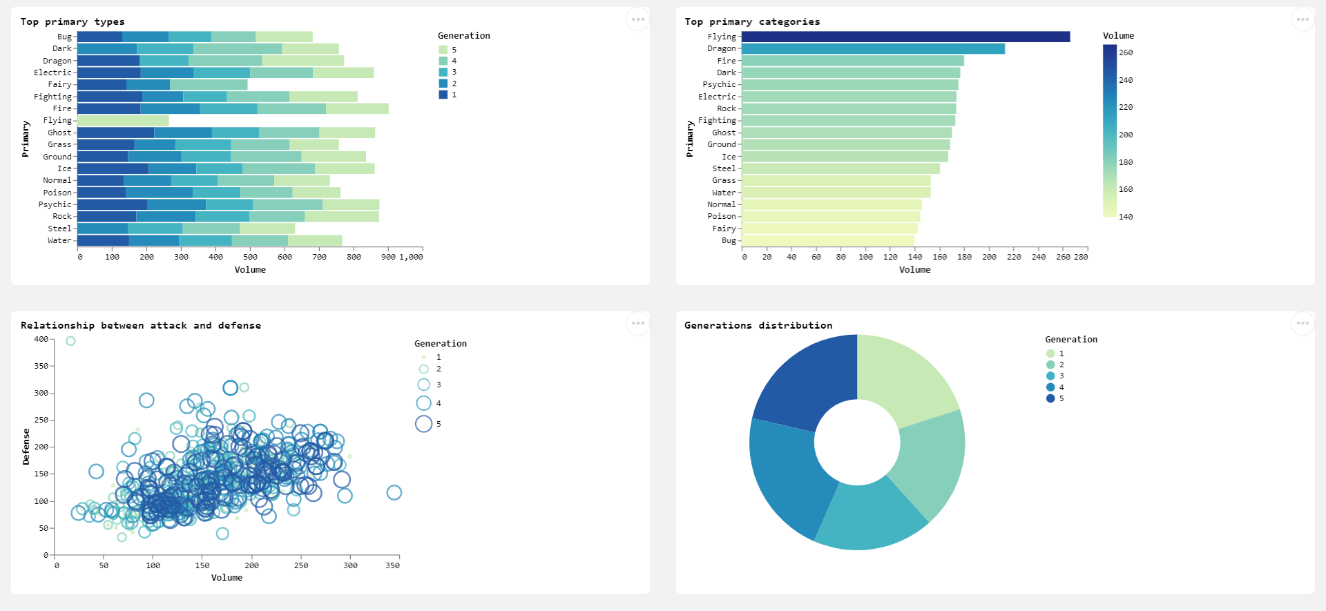
VegaLite anyone?
There are several reasons why you want to get familiar with VegaLite.js:
- It is arguably much more simple to use than D3.js.
- Unlike most JavaScript based charting libraries like Charts.js or Highcharts, Vegalite natively supports data aggregation. This means that if you’re reading a .csv file or querying data from a SQL database, you won’t need to write your own aggregation functions or import third-party libraries.
- If you’ve ever used the Altair plotting library in Python, then you’ll be happy to know that it is entirely based on VegaLite.
Creating our first chart
Simply write an HTML file and name it as you want (I’ve named mine index.html. Within your HTML <head></head> tags, add the following lines to load the VegaLite libraries that are hosted on the JsDelivr Content Delivery Network. The versions you get should be different than the ones you will see below, but that doesn’t matter.
<script src="https://cdn.jsdelivr.net/npm/vega@5.20.2"></script>
<script src="https://cdn.jsdelivr.net/npm/vega-lite@5.1.0"></script>
<script src="https://cdn.jsdelivr.net/npm/vega-embed@6.17.0"></script>
Moving over to the <body></body> tags, simply create a pair of <div></div> tags and give them an id="vis" (or whichever name you want to) and while we’re here also add in some random text using <p></p> tags.
<p>My First plot</p>
<br>
<div id="vis"></div>
Below the <div> tags but still inside your <body></body> tags, create a pair of <script></script> tags and paste the following code between them:
let FirstPlot = {
        $schema: "https://vega.github.io/schema/vega-lite/v5.json",
        data: {
          values: [
            {Languages: "Python", Values: 2},
            {Languages: "Python", Values: 3},
            {Languages: "Python", Values: 2},
            {Languages: "JavaScript", Values: 4},
            {Languages: "Perl", Values: 2}          ]
        },
        mark: "bar",
        encoding: {
          x: {field: "Values", type: "quantitative"},
          y: {field: "Languages", type: "ordinal"}

        }
      };
      vegaEmbed("#vis", FirstPlot);
One fundamental concept to grasp here, is the type of each set of variables, as can be seen within the encoding parameter:
"quantitative":is used for numerical data"ordinal":refers to the ranked data (alphabetical for categorical, from lowest to highest value for numerical variables)"nominal":is used for categorical data"temporal":should be reserved for time series, and will ensure the variables are kept in chronological order
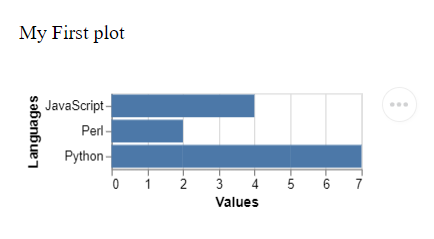
Now refresh your HTML page and you should see your first VegaLite chart!
Working with real data
As you have probably already noticed, we have created a variable called FirstPlot, which contains a schema that you should update every time a new version comes up. Your FirstPlot object will also contain:
data: That’s pretty self-explanatory, and this is where we’ll be calling our .csv files from.mark: This is where we will choose the type of visualisation that we want to see.encoding: We’ll be assigning our x and y axis here (and doing some aggregation work), but also whichever color scheme we pick.
There are other fields that can be of interest to us, and we’ll get to these in a minute. But at this point, we should first choose a dataset and get familiar with it. Head over to my GitHub page and download the file named “pokemon_go.csv”. There are two main reasons for picking this dataset: it contains a good balance between categorical and numerical data, and most importantly it is clean and won’t require any pre-processing work.
If you’re using a Linux distribution (I’m on Ubuntu), just copy and paste the following line into your CLI:
column -s"," -t pokemon_go.csv | head

Let’s remove the code between the pair of <script></script> tags and paste this in instead:
let getBarPlot = (plotLocation) => {
  let spec = {
  "$schema": "https://vega.github.io/schema/vega-lite/v2.0.json",
  "width": 400,
  "height": 250,
  "config": {"axis": {"grid": false}, "view": {"strokeWidth":0},"font":"verdana", "background":"white"},
  "title": {"text":"Top primary types", "anchor":"start"},
  "description": "Pokemon dataset visualiszation",
  "data": {"url": "https://raw.githubusercontent.com/julien-blanchard/dbs/main/pokemon_go.csv"},
  "mark": {"type":"bar", "tooltip": true},
   "encoding": {
    "x": {"field": "Attack", "aggregate": "mean", "title": "Volume"},
    "y": {"field": "Primary", "type": "nominal"},
    "color": {"field":"Generation","type":"nominal", "sort":"descending", "scale": {"scheme": "yellowgreenblue"}}
    }
  }
  vegaEmbed(plotLocation, spec, {})
};

getBarPlot("#vis")
When we refresh our index.html file, we are now greeted with this arguably much better looking stacked bars chart.
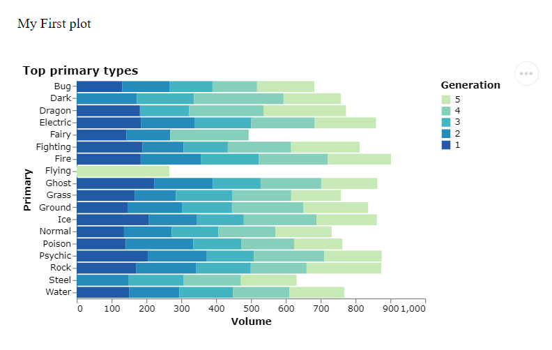
So, what are the major differences between our first chart, and this one?
- We have now placed our code within a function named
getBarPlot(), which will allow us at a later stage to place all our JavaScript code in individual .js files, and simply call the desired functions from the index.html file. - We have defined the
"width":and"height":of the chart and added a"title":. - The main big change really, can be found in
"data":, wherevaluehas been replaced with"url":, and a direct link to the .csv file from my GitHub repo. - We also have a new
"config":parameter where the background color has been set to white and the grid removed.
Now, let’s take a closer look at the changes made inside the "encoding": parameter:
"encoding": {
          "x": {"field": "Attack", "aggregate": "mean", "title": "Volume"},
          "y": {"field": "Primary", "type": "nominal"},
          "color": {"field":"Generation","type":"nominal", "sort":"descending", "scale": {"scheme": "yellowgreenblue"}}
          }
We are aggregating the numerical values "Attack", taking its "mean" value for each categorical "Primary" value, as if we were doing the following in SQL:
SELECT
   Primary
   , AVG(Attack) AS Avg_attk
FROM
   pokemon_go
GROUP BY
   1
To create stacked bars, we are adding a third dimension and assigning it to the "color": attribute (for more information on the color palettes you can pick, please refer to this page).
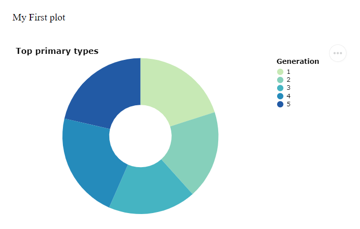
Changing the type of charts we want to ouput should now be easy, as there’s no reason to modify any of the styling parameters. For a donut plot, let’s simply change the "mark": and "encoding": parameters to:
"mark": {"type": "arc", "innerRadius": 50, "tooltip": true},
"encoding": {
    "theta": {"field": "Attack", "aggregate": "mean"},
    "color": {"field":"Generation","type":"nominal", "scale": {"scheme": "yellowgreenblue"}}
And refreshing the page should now show this:
CSS Flexboxes
Ok, that’s pretty cool, but how can we structure our HTML page so that its layout resembles the look and feel that a dashboard would provide?
The simplest and most efficient way to do this is by using CSS Flexboxes. If you’re not familiar with this layout model I highly recommend you watch this short but very informative YouTube video (and Fireship’s whole channel in general):
According to Wikipedia:
“The flex layout allows responsive elements within a container to be automatically arranged depending upon screen size (or device).”
And that’s really it. Our “index.html” file will now contain a pair of <div></div> tags with a "container" class between them. Roughly speaking, what we want to achieve here, is to display four boxes over two rows, with two boxes for each row. And naturally, each of these four boxes will contain one chart. To do so, a .css file will have to be created, but we’ll get to that in a minute.
1 What we need first, is a new file named “script.js”, so that we can move the getBarPlot() function into it.
2 As discussed just above, we’re then going to create a “style.css” file and throw the following lines of code in there:
#wrapper {
  background-color: #F2F2F2;
  font-family: Verdana;
}

.container {
  display: grid;
  grid-template-columns: repeat(2, 1fr);
  grid-column-gap: 30px;
  grid-row-gap: 30px;
  padding:5px;
  margin: 5;
}

.box {
  background-color: white;
  border-top-left-radius: 5px;
  border-top-right-radius: 5px;
  border-bottom-left-radius: 5px;
  border-bottom-right-radius: 5px;
  padding: 5px;
}
3 Finally, we’re going to be making some changes to our “index.html” file.
Let’s start by adding the following two lines of code inside our <head></head> tags:
<link rel="stylesheet" href="style.css">
<script type="text/javascript" src="script.js"></script>
The last step is to change our <body></body> tags to:
<body id="wrapper">
  <p>My First plot</p>
  <br>
  <div class="container">
    <div class="box" id="vis1">
      <script type="text/javascript">getBarPlot("#vis1")</script>
    </div>
    <div class="box" id="vis2">
      <script type="text/javascript">getBarPlot("#vis2")</script>
    </div>
    <div class="box" id="vis3">
      <script type="text/javascript">getBarPlot("#vis3")</script>
    </div>
    <div class="box" id="vis4">
      <script type="text/javascript">getBarPlot("#vis4")</script>
    </div>
  </div>
</body>
Once we refresh our index.html file, we should now see the same donut plots (or bar plots if you reversed back the Javascript function to its original state) repeated four times over two rows and two columns of white boxes:
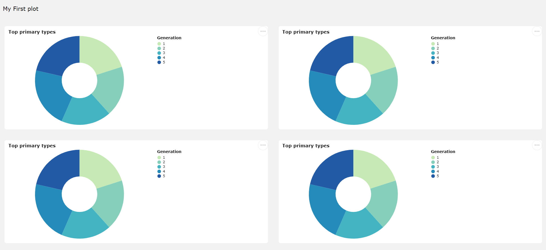
So, what happened there?
-
Inside the .html file we have added an
id="wrapper"to the<body></body>tags, which if we check the .css file simply changes the background color for the whole page to grey, as well as the font type. -
More interestingly, there’s now this pair of
<div></div>tags, which are referenced to using a"container"class. If we look for its corresponding attributes inside the style.css file, the two most important lines aredisplay: grid;andgrid-template-columns: repeat(2, 1fr);. The first one turns the main<div>element into a grid (think of this as rows and columns), and each children<div>tags within the parent<div>tags as items of the aforementioned grid. The second line helps us set the layout of that grid. If you want to learn more, this website is quite comprehensive. -
All children
<div>tags share a"box"class, and an individual"vis"id. The former is simply there to set the background color for each box and make their corners rounded, while as we saw earlier, the latter will be used as references as to where to display each chart.
Plots, plots everywhere!
All that’s left to do, is add in a bit of variety and create some functions to output a bubble plot, and a simple (non stacked) bar plot.
At this stage, there’s no real point going into too much detail as to how we can create those. We saw earlier on how easy it was to output different types of charts using VegaLite.js. This framework supports a multitude of differents visualisation types, and if you think that this is something you may find a use for then I definitely recommend you check their gallery.
Anyway, we can now be proud of our final dashboard, which once we have created some new plotting functions will look quite neat!

You can find the full code for this dashboard directly on my GitHub repository. Simply download these three files, and make sure you update the libraries to their latest versions.
That’s all for today, stay tuned for more!