Pandas-Bokeh: The Simplicity of Pandas Plots, the Interactivity of Bokeh
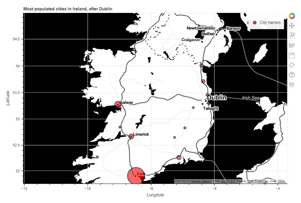
An example of what we’ll be doing in this article
Sometimes, all we want is to be able to use a framework or a library that we’re not too familiar with, without necessarily spending too much time learning its syntax in depth. Personally, and though I have extensively used some visualisation packages such as Matplotlib, Seaborn, Plotly, or Altair, I must confess that Bokeh is one of these tools that I have never given much attention to. Not that I hold anything against this library, or that I had any bad experience with it in the past, but you just can’t learn everything. Or at least, I can’t.
If you can also relate to this, then you’ll probably be happy to know that the purpose of Pandas-Bokeh is to integrate Bokeh, one of the most popular data visualisation libraries within the Python ecosystem, directly as a back-end plotting extension for the popular Pandas data analysis framework.
Here is what its author, Patrick Hlobil, has to say about his library:
“With Pandas-Bokeh, creating stunning, interactive, HTML-based visualization is as easy as calling: df.plot_bokeh()”
That sounds promising, right?
The basics
Before we can import Pandas-Bokeh, we of course need to install it. I used pip, but feel free to use conda instead if you prefer (actually, you should pretty much always choose Conda).
pip install pandas-bokeh
Importing the library is simple, just make sure that you enable plots to be embedded in the cell output of the notebook that you’re working from if you’re using a Jupyter-like environment.
import pandas as pd
import pandas_bokeh
pandas_bokeh.output_notebook()
One thing that’s missing before we can start toying around with our first charts, is an actual dataset. More specifically, we are going to combine two HTML tables from Wikipedia, and join them on they “County” column to create a Pandas DataFrame object. Duplicate columns will bear the "_y" suffix, which should make dropping them easy.
def getTables() -> pd.DataFrame:
    df_left = pd.read_html("https://en.wikipedia.org/wiki/List_of_Irish_counties_by_area")[0]
    df_right = pd.read_html("https://en.wikipedia.org/wiki/List_of_Irish_counties_by_population")[0]
    df_left.columns = [x.split(" (")[0].title() for x in df_left.columns]
    df_right.columns = [x.split(" (")[0].title() for x in df_right.columns]
    df_joined = pd.merge(
        left = df_left
        , right = df_right
        , how = "left"
        , left_on = "County"
        , right_on = "County"
        , suffixes = ("", "_y")
    )
    return df_joined

df = getTables()
df.head()

We should probably do some basic data cleaning first. We need to remove the duplicate series, get rid of the weird square brackets that follow each value within the ["Area"] serie, change the data type for these variables to float, and then nornalise all our numerical data.
def getCleanedDataframe(data: pd.DataFrame) -> pd.DataFrame:
    result = (
    data
    .drop(df.tail(2).index)
    .drop(data.filter(regex="_y$").columns,axis=1)
    .rename(columns = {"Traditional Province": "Province"})
    .assign(Area = lambda x:x["Area"].str.split(pat=" ", expand=True)[0])
    .assign(Area = lambda x:x["Area"].str.replace(",","").astype(float))
    .apply(lambda x: (x-x.min()) / (x.max() - x.min()) if x.dtype == "float" else x, axis=0)
    .sort_values("Density", ascending=True)
    )
    return result

plot = getCleanedDataframe(df)
plot.head()

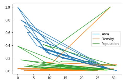
That’s much better. Let’s start by comparing what happens when we use Pandas’s native .plot() method, versus what we get when we call Pandas-Bokeh’s .plot_bokeh() method instead:
- Pandas:
plot.plot()
- Pandas-Bokeh:
plot.plot_bokeh()
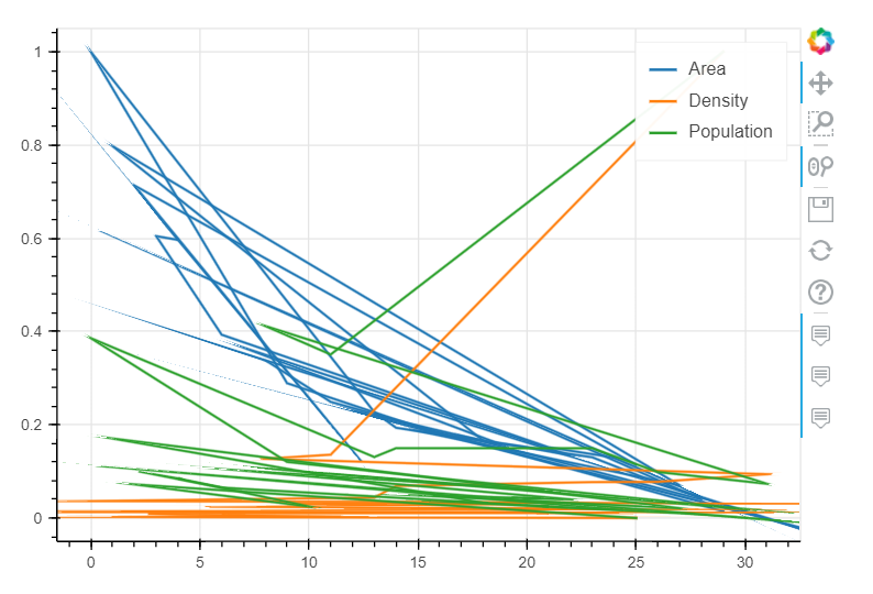
As you can see from the two images above, the outputs are almost identical. As we forgot to specify which kind= of chart we wanted, or what serie would be passed into the x= and y= axis, we got two very similar-looking line charts. Even the default colors are the same.
Some simple plots
As of spring 2022, the following types of visualisations are supported:
- line plots
- point plots
- step plots
- scatter plots
- bar plots
- histograms
- area plots
- pie plots
- map plots
Where I think Pandas-Bokeh really provides additional value is in its support of GeoPandas and geo plots in general, and so we won’t be spending too much time covering the different standard charts that can be generated with the daframe that we created earlier on. If you want to see what the aformentioned visualisations look like, you can simply refer to the official documentation.
For now, we’re only going to create a simple bar chart, see how to do some basic time series plotting, and then move on to some more interesting stuff.
But before we get there, we should try and see what happens when we start passing some parameters into the plot_bokeh() method. If you’re already familiar with Pandas’s .plot(), the function below shouldn’t contain anything fundamentally new to you. But don’t worry if you’re not, all the parameters that you will see in the following code snippet are pretty self-explanatory I think.
def getBarPlot(data: pd.DataFrame,title: str):
    data.plot_bokeh(
        kind="barh"
        , figsize=(800,500)
        , x="County"
        , y=["Density","Population","Area"]
        , stacked=True
        , colormap=["#30a2da","#fc4f30","#e5ae38"]
        , alpha=0.6
        , title=title
    )

getBarPlot(plot,"Area and density distribution by county")
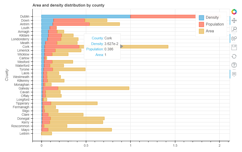
The main difference, really, lies in the values that we pass into the figsize() parameter. Pandas’ .plot() and Pandas-Bokeh’s .plot_bokeh() use different units of measurement, and if you try to pass integer values over 50 in Pandas’s built-in method you’ll likely be told that your notebook just crashed. To avoid this, when using the built-in .plot() method, you can obtain similar results by either leaving .figsize() blank or by entering a smaller pair of integers, like 12,8 for instance.
Visualising time series data works in a similar fashion, save for the fact that we’ll be changing the kind= parameter to either "line" or "area" depending on whether we want the area under the line to be filled or not.
We’re going to use a new dataset, as the previous one didn’t contain any datetime value.
def getPopulation(table_url: str) -> pd.DataFrame:
    population = pd.read_html(table_url)[8]
    return population

pop = getPopulation("https://en.wikipedia.org/wiki/Demographics_of_the_Republic_of_Ireland")
pop.head()

Of course, we’re going to have to do a bit cleaning first:
def getCleanedPop(data: pd.DataFrame) -> pd.DataFrame:
    result = (
        data
        .drop(df.tail(1).index)
        .set_index(pd.DatetimeIndex(data["Unnamed: 0"].values[:-1]))
        .drop(columns="Unnamed: 0")
        .assign(
            Upper_thshld = lambda x: (x["Population on 1 April"].mean() + x["Population on 1 April"].std().round(0)),
            Lower_thshld = lambda x: (x["Population on 1 April"].mean() - x["Population on 1 April"].std().round(0))
            )
        .dropna()
        .resample("10y").mean()
    )
    return result

population = getCleanedPop(pop)
population.head()

We passed the datetime values as the index of our DataFrame, added in some upper and lower thresholds, and averaged the numerical value on a 10 year window.
def getLinePlot(data: pd.DataFrame,title: str):
    data.plot_bokeh(
        kind="step"
        , figsize=(1100,500)
        , x=data.index
        , y=["Population on 1 April","Upper_thshld","Lower_thshld"]
        , colormap=["#30a2da","#fc4f30","#e5ae38"]
        , alpha=0.6
        , legend="bottom_right"
        , rangetool=True
        , title=title
    )

getLinePlot(population,"Population over time")
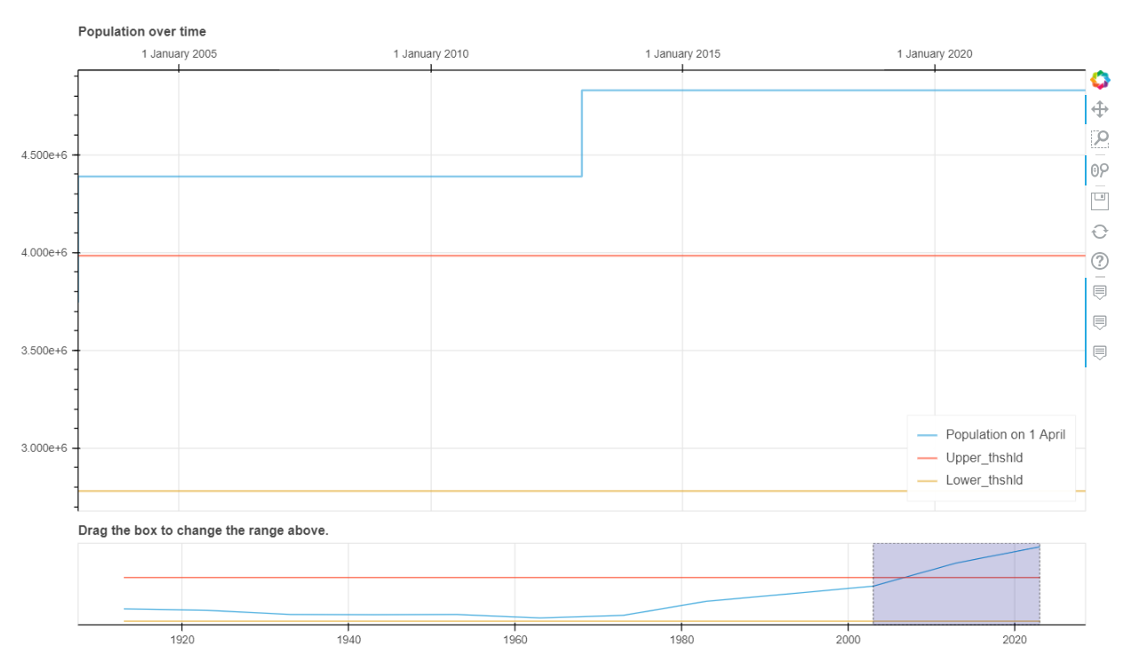
Guess what? Creating a line chart is just as easy as creating a bar chart, or any type of chart that is currently supported!
You’ll however notice a couple of new parameters that I think are worth discussing:
- we enabled a slider at the bottom of the chart, by setting the
rangetoolparameters toTrue - we also used
kind="step"instead of"line", which makes identifying strong fluctuations easier
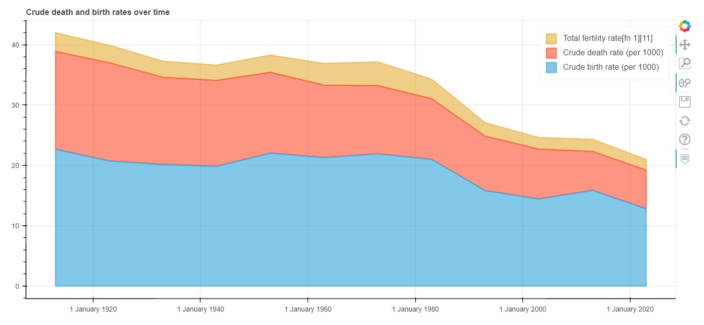
All that’s left to do now is generate a simple stacked area plot that compares the volume of births and deaths over time:
def getStackedLinePlot(data: pd.DataFrame,title: str):
    data.plot_bokeh(
        kind="area"
        , figsize=(1100,500)
        , x=data.index
        , y=["Crude birth rate (per 1000)","Crude death rate (per 1000)","Total fertility rate[fn 1][11]"]
        , stacked=True
        , colormap=["#30a2da","#fc4f30","#e5ae38"]
        , alpha=0.6
        , legend="top_right"
        #, rangetool=True
        , title=title
    )

getStackedLinePlot(population,"Crude death and birth rates over time")
Why use Pandas-Bokeh then?
The charts that we have seen so far are arguably very basic, and in most cases sticking to Pandas’s built-in .plot() will do just fine. But where I think that Pandas-Bokeh provides real additional value, is in its support of interactive sidetables and geoplots.
- Interactive sidetables
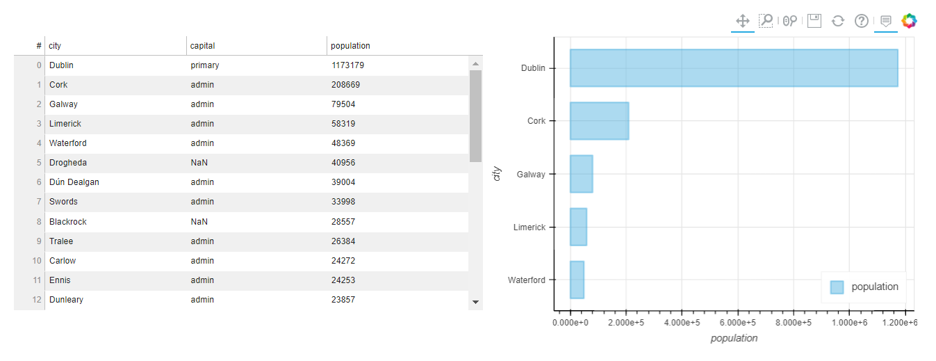
Fundamentally, what we’re talking about here is simply a side-by-side DataFrame combined with any type of chart that can be derived from it. Say, for instance, a data table and a scatter plot. But why is this relevant to what we have been discussing so far in this article you might wonder? Well, with the recent release of PyScript, aka “Python in the browser”, it is now possible to easily create simple dashboards without having to use Plotly Dash or web app frameworks like Streamlit and Voila. You can instead, in less than 5 minutes, create and share an HTML page, get some users to upload a .csv file through a couple of simple <input> and <button> elements, and automatically output an interactive DataFrame and any associated chart that you want. You could even add in some more HTML elements like <select> and <option>, get your users to pick a specific serie and a machine learning model, and perform any data science task that they want to in just a few clicks.
All that’s needed to generate an interactive sidetable is to import of couple of new dependencies:
from bokeh.models.widgets import DataTable, TableColumn
from bokeh.models import ColumnDataSource
We start by creating a simple variable that we can name right, and assign a bar plot object to it. We then use the DataTable() method to create an interactive table, and assign it this time to a variable named left. Finally, we concatenate our left and right objects using the plot_grid() method.
def getSideTable(data: pd.DataFrame):
    table_data = (
        data
        .filter(["city","capital","population"])
    )
    left = DataTable(
        columns=[TableColumn(field=c, title=c) for c in table_data.columns],
        source=ColumnDataSource(table_data),
        height=350,
    )
    right = (
        data
        .head()
        .sort_values("population", ascending=True)
        .plot_bokeh(
            kind="barh"
            , x="city"
            , y="population"
            , color="#30a2da"
            , legend="bottom_right"
            , alpha=0.4
            , show_figure=False
                )
    )
    result = pandas_bokeh.plot_grid(
        [[left, right]]
        , plot_width=550
        , plot_height=400
        );

getSideTable(df)
- Geoplots
Basically, a geo plot is nothing else but a scatter plot, with a tiled web map in the background. If you’re not too familiar with open source tile providers (I’m not), you can learn more about them here. Bokeh-Pandas supports the following web maps, so you can always play around with them and see which one best suits your needs (I personally like “OSM”):
- Cartodbpositron
- Cartodbpositron_Retina
- Stamen_Terrain
- Stamen_Terrain_Retina
- Stamen_Toner
- Stamen_Toner_Background
- Stamen_Toner_Labels
- Osm
- Wikimedia
- Esri_Imagery
We’re going to have to make a few changes here, like specify that we want to work with geospatial data by adding a .map() method right after .plot_bokeh(). You will also notice that we can use HTML elements to format the hovertool_string= parameter, and that it’s preferable to create a new serie (here named ["pop_size"]) to adjust the size of the markers.
Note: the dataset below comes from Simple Maps.
def getGeoPlot(data: pd.DataFrame, title: str):
    data["pop_size"] = data["population"] / 4000
    data.plot_bokeh.map(
        x="lng"
        , y="lat"
        , hovertool_string="""
            <h3> @{city} </h3>
            <h3> Population: @{population} </h3>
            """
        , tile_provider="OSM"
        , size="pop_size"
        , category="population"
        , colormap="Bokeh"
        , alpha=0.5
        , line_color="black"
        , line_width=3
        , legend="City names"
        , figsize=(900, 600)
        , title=title
        )

getGeoPlot(df[1:], "Most populated cities in Ireland, after Dublin")
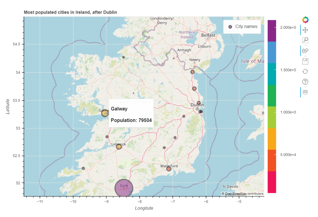
We can get some pretty neat effects by switching the tile_provider value to "STAMEN_TONER" and by removing the category parameter:

And that’s not all, Pandas-Bokeh also supports GeoPandas, which makes working with geospatial data in python much easier. You can find some examples here.
That’s it for today! I hope that this article has made you want to give Pandas-Bokeh a try.