My Favorite Plots Using Matplotlib - Part I
Before I start, let me just be clear and say that there are many, many great things that one can do with Matplotlib. And most importantly, similar results can be achieved in multiple different ways. What you will see in this article is by no means any sort of universal truth, and if you like to visualise your data in a different way, then that’s perfectly fine!
This is not a tutorial
The purpose of this article isn’t to go through the fundamentals of Matplotlib and Seaborn, but simply for me to share some of the plotting functions that I have been using the most while working as a data analyst.
I will also include some data pre-processing functions that can make your life much easier and hopefully help you create beautiful and meaningful plots.
Pick your poison
There are mainly two different schools of thought when it comes to creating and rendering charts using Matplotlib or Seaborn (or maybe three if we include people who only visualise their data using the Pandas .plot() method).
- Many people will prefer using
.subplots(), and unpack the figure and axes objects from the tuple that this function creates:
fig,ax = plt.subplots()
ax.plot(x, y)
- Though I can perfectly understand why one might want to do that, I’ve always been more enclined to build my charts this way:
plt.figure()
plt.plot(x,y)
plt.show()
All the code that you will find throughout this article will be written using the second approach, but I guess it wouldn’t take much effort to make it fit into the .subplots() way.
Prepare your data first
We’ll be using a random video games dataset that I found on Kaggle a long time ago.
def getDataframe(csv_file):
    df = pd.read_csv(csv_file)
    return df

df = getDataframe("videogamessales.csv")
df.sample(5)
This is what our raw data looks like. We have some categorical and numerical variables, nothing fancy or that needs any preprocessing.

Now let’s take a look at the three main aggregating functions that I like to use:
- This might seem a bit overkill, but I like to have a function that counts elements within a Pandas serie, and returns the output as a dataframe object.
from collections import Counter

def getCount(serie,howmany):
    counted = Counter(serie)
    labels = [l for l,v in counted.most_common(howmany)]
    values = [v for l,v in counted.most_common(howmany)]
    result = pd.DataFrame({"Labels":labels,"Values":values})
    return result

getCount(df["Publisher"],6)
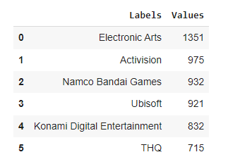
Now to be fair, it’d probably be much easier to write x = df["Publisher"].value_counts().keys()[:6] and then y = df["Publisher"].value_counts().values[:6] but I like to have a dataframe on which I can apply some methods like .query() if needed.
- The next function does something a bit similar, but returns how many instances of
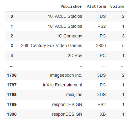
serie2can be found within each uniqueserie1. This is particularly useful for stacked bar plots. As you probably already know if you’ve read some other articles in this blog, I’m not a big fan of multi-level indexing and that’s what lines 3 and 4 ungracefully try to get rid of.
def getDoubleCount(data,serie1,serie2):
    count = data.groupby([serie1,serie2])[[serie2]].count()
    count.rename(columns={serie2:"volume"}, inplace=True)
    count.reset_index(drop=False, inplace=True)
    return count

getDoubleCount(df,"Publisher","Platform")
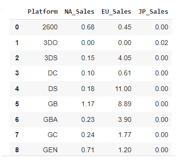
- While we’re here, we might also want to create a function that allows us to do some SQL-like aggregations, freely picking whichever calculation we want to do.
def getGroupBy(data,serie,aggr):
    grouped = data.groupby(serie, as_index=False).agg(aggr)
    return grouped.round(2)

getGroupBy(df,"Platform", {"NA_Sales":"mean","EU_Sales":"max","JP_Sales":"min"})
- And finally, we’ll sometimes need a function that transposes the unique values within a serie into several individual series, then counts their values as rows against another unique serie. If this isn’t clear (it isn’t to me as I’m writing these lines), then let’s see a concrete example:
def getDummies(dataframe,filtered,pivoted,howmany,ind):
    # dummies
    data = dataframe.filter(filtered)
    dummies = pd.get_dummies(data, prefix="count", columns=pivoted)
    for c in dummies.columns.to_list()[1:]:
        dummies.rename(columns={c: c.replace("count_","")}, inplace=True)
    # limiting the number of columns
    top = {}
    for c in dummies.columns.to_list()[1:]:
        top[c] = dummies[f"{c}"].sum()
    top = sorted(top, key=top.get, reverse=True)[:howmany]
    top.insert(0, ind)
    dummies = dummies.filter(top)
    # reducing the number of cols
    agg = {}
    for c in dummies.columns.to_list()[1:]:
        agg[c] = "sum"
    dummies = dummies.groupby(ind, as_index=False).agg(agg)
    return dummies

# dummies table for the top 6 elements
dummies = getDummies(df,["Publisher","Platform"],["Platform"],6,"Publisher")
dummies
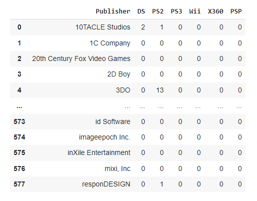
Alright, that should hopefully make more sense now!
It’s all about style
- Templates
Both Matplotlib and Seaborn have their own styling templates, which can be called as follows:
from matplotlib import style as style
style.use("whichever style you choose to use")
Or
import seaborn as sns
sns.set_style("same as above")
I personally like to use Seaborn’s "whitegrid", but Matplotlib’s "fivethirtyeight" is also a widely popular choice.
The full list of templates for Matplotlib is available here, and there for Seaborn.
- Colormaps
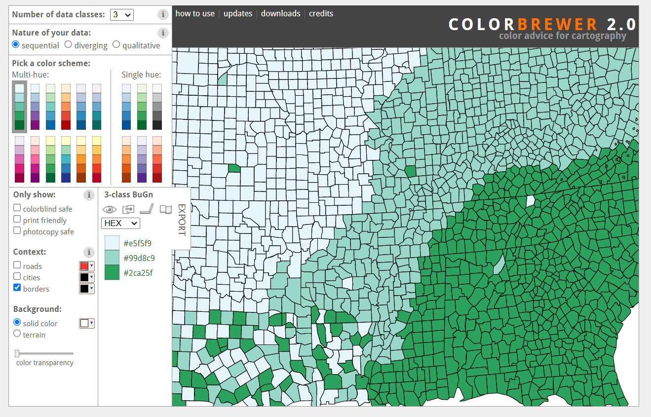
From a colour scheme perspective, the palette “Blues” (or “Blues_r” for reversed colors) will be used. This color hue is part of Cynthia Brewer’s ColorBrewer color schemes, and you should make sure to check out the comprehensive list of supported colormaps if you want to add colors palettes to your charts.
| Note: who is Cynthia Brewer? |
|---|
| Cynthia Brewer is an American professor of geography who developed in 2002 the famous online ColorBrewer tool, which provides colorblind-friendly sets of colors that serve as the basis for many of the modern data visualisation tools. |
- RC parameters
Oh, one last thing that I find quite important, is to set high-level rcParams that once loaded onto runtime memory will apply to all of our plots. RC stands for runtime configuration, and will save you some time as the parameters set during this process will affect all your Matplotlib and Seaborn charts.
rc = {
    "figure.figsize": (18,5),
    "axes.edgecolor": "white",
    "font.family": "monospace",
    "font.size": 13
     }
plt.rcParams.update(rc)
Here for instance, we’re setting the default figure size for each plot, the font family, etc.. Please note that these settings can be individually overridden if needed. You can find a comprehensive list of rcParams on this page.
Show me the money
It seems like we are finally ready to create some plots and explore our dataset!
- Categorical data
Using the data aggregation functions we defined earlier, we can start with two side-by-side bar charts to show the most common values for df["Publisher"] and df["Platform"].
def getBarCharts(x1,y1,x2,y2,my_title1,my_title2):
    fig = plt.figure()
    plt.subplot(121)
    left = sns.barplot(x=x1, y=y1, orient="h", palette="Blues_r")
    sns.despine(left=True, right=True, top=True, bottom=True)
    plt.xlabel("")
    plt.ylabel("")
    left.set_title(my_title1)
    plt.subplot(122)
    right = sns.barplot(x=x2, y=y2, orient="h", palette="Blues_r")
    sns.despine(left=True, right=True, top=True, bottom=True)
    plt.xlabel("")
    plt.ylabel("")
    right.set_title(my_title2)
    plt.subplots_adjust(wspace = 0.2, hspace = 0.4, top = 0.9)
    plt.show()

left = getCount(df["Publisher"], 7)
right = getCount(df["Platform"], 7)

getBarCharts(left["Values"], left["Labels"],
             right["Values"], right["Labels"],
             "Top publishers", "Top platforms"
             )

The left and right variables will hold the aggregated dataframes that we can create using the .getCount() function. Please note that as the bars are set to be horizontal (orient="h"), the x parameter in sns.barplot() takes the numerical values as found under ["Values"], while the y parameter contains the categorical values as found under ["Labels"].
To split the figure into side-by-side subplots, we pass three elements into the plt.subplots() method: the first number (here 1) stands for the y axis and shows that we want one vertical level. The second number (here 2) means that we want two plots on the horizontal x axis, while the third value (here 1, then 2) refers to the current plot that we are editing. We can further down use the function plt.subplots_adjust() to refine the spacing between each subplot.
Next comes a set of stacked horizontal bars that we will use to count the volume of platforms for each video games editor. This is when the getDummies() function that we defined earlier will come in handy.
def getStackedBars(data,x,title):
    data.plot(
        kind="barh",
        x=x,
        stacked=True,
        legend="upper right",
        title=title,
        cmap="Blues_r"
        );

d = dummies.query("Publisher in ('Electronic Arts','Namco Bandai Games','Activision','THQ','Ubisoft')")
getStackedBars(d,"Publisher","test")

What you see above should be self-explanatory. We’re using Pandas’s built-in .plot() method as it makes visualising stacked bars much easier. If you’re wondering why I added a semi-colon ";" after the closing parenthesis, well that’s because we get the following message if we don’t (which actually isn’t an error message, but it just doesn’t look good I think):
<matplotlib.axes._subplots.AxesSubplot at xxxxx>
Another thing we can do with this dataset, is visualise the most recurring tokens using a word cloud. Or rather, two side-by-side word clouds. To get these, we first need to import the wordcloud library, and then join both df["Publisher"] and df["Name"] as strings. We could also remove stopwords, but to do that we’d need a list of tokens, which we don’t.
from wordcloud import WordCloud, STOPWORDS

def getWordCloud(text_left,text_right,title):
    text_left = " ".join(text_left)
    text_right = " ".join(text_right)
    wc_left = WordCloud(max_words=200, width=600, height=400, background_color="white", margin=0, max_font_size=80, min_font_size=10, colormap="Blues_r").generate(text_left)
    wc_right = WordCloud(max_words=200, width=600, height=400, background_color="white", margin=0, max_font_size=80, min_font_size=10, colormap="Blues_r").generate(text_left)
    plt.figure()
    plt.suptitle(title, size=20, y=1)
    plt.subplot(1,2,1)
    plt.imshow(wc_left)
    plt.axis("off")
    plt.subplot(1,2,2)
    plt.imshow(wc_right)
    plt.axis("off")
    plt.show()

getWordCloud(df["Publisher"].dropna(),df["Name"],"Top keywords")

- Distribution
We will also want to visually assess the distribution of numerical variables, using either a set of histograms, ridge lines, or violin plots.
def getHistPlots(x1,x2,title1,title2):
    fig = plt.figure()
    plt.subplot(121)
    left = sns.histplot(x1, kde=True, bins=10, palette="Blues_r")
    sns.despine(left=True, right=True, top=True, bottom=True)
    plt.xlabel("")
    plt.ylabel('')
    left.set_title(title1)
    plt.subplot(122)
    right = sns.histplot(x2, kde=True, bins=10, palette="Blues_r")
    sns.despine(left=True, right=True, top=True, bottom=True)
    plt.xlabel("")
    plt.ylabel("")
    right.set_title(title2)
    plt.subplots_adjust(wspace = 0.2, hspace = 0.4, top = 0.9)
    plt.show()

left = df.query("Publisher == 'Ubisoft'")
right = df.query("Publisher == 'Electronic Arts'")

getHistPlots(left["Year"],right["Year"],"Years (Ubisoft)","Years (EA)")

To be fair, the logic behind these side-by-side plotting functions is pretty much identical. What changes really is the sns.type_of_plot_you_want_to_get() method that we end up picking. You’ll notice that .histplot() allows for manually choosing the number of bins that we want to see, as well as enabling kde=True which will:
"(..) compute a kernel density estimate to smooth the distribution and show on the plot as (one or more) line(s)." Source
We’re almost there! I’m personally not a big fan of violin plots, but I have been asked on several occasions to incorporate this type of visualisation into reports that we would provide for other data-focused teams or for leadership, and I thought I might as well share the simple function I ended up writing.
def getViolinPlots(data,x,y,title):
    plt.figure()
    sns.boxplot(data=data, x=x, y=y, orient="v", palette="Blues_r")
    plt.title(title)
    sns.despine(left=True, right=True, top=True, bottom=True)
    plt.show()

violin = df.query("Publisher in ('Ubisoft','Electronic Arts')")
getViolinPlots(violin,"Publisher","Year","Release years for Ubisoft and EA")

- Correlation
I’ve kept for the last part of this article the two plotting functions that I have used the most as a data analyst over the past couple of years, especially for technical presentations or when investigating the dependence between multiple variables within a same serie.
def getCorrPlot(data,x,y,howmany,title):
    # aggregation
    corr = data.filter([x,y])
    dataframe = getCount(data[y],howmany)
    dataframe = dataframe["Labels"].to_list()
    corr = corr.loc[corr[y].isin(dataframe)]

    # dummies and re aggregation

    corr = pd.get_dummies(corr,prefix="",prefix_sep="",columns=[y])
    aggregate = {}
    for col in corr.columns[1:]:
        aggregate[col] = "sum"
    corr = corr.groupby(x, as_index=False).agg(aggregate)

    # normalising
    for col in corr.columns[1:]:
        corr[col] = np.log(corr[col] + 1)

    # correlation matrix
    corr.drop(columns=[x],inplace=True)
    corr = corr.corr()
    sns.clustermap(corr, figsize=(10,10), cmap="Blues")
    sns.despine(left=True, right=True, top=True, bottom=True)
    plt.title(title)
    plt.show()

getCorrPlot(df,"Publisher","Platform",10,"Correlation plot")
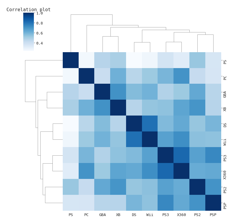
I find Seaborn’s .clustermap() method to be particularly suited for small to medium size datasets, as larger samples might make the cluster trees on top difficult to read. A clustermap combines hierarchical clusters with traditional heat map plots. I would strongly advise you to normalise all your variables before running this type of plot though (see the line that says np.log(corr[col] + 1)).
For larger datasets, I would recommend giving NetworkX a try. This is a great library for anyone who wants to study the structure, dynamics, and functions of a given graph or network. I won’t spend much time on graph theory, first because it’s not what we are discussing in this article, but also because I really wouldn’t consider myself an expert in that field. If you want to understand the basics of graph theory, I encourage you to start by visiting this website.
import networkx as nx
n = df.filter(["Publisher", "Platform", "Year"])

def getNetwPlot(data, serie1, serie2, serie3):
    G = nx.from_pandas_edgelist(data, serie1, serie2, edge_attr=True)
    edgelist = nx.to_edgelist(G)

    colors = [i/len(G.nodes) for i in range(len(G.nodes))]

    plt.figure(figsize=(12,8))
    nx.draw(
        G,
        with_labels=True,
        node_size=[v * 200 for v in dict(G.degree()).values()],
        width=[v[2][serie3] / 500 for v in edgelist],
        font_size=10,
        node_color=colors,
        cmap="BuPu"
    )
    plt.title("NetworkX")
    plt.show()

getNetwPlot(n, "Publisher", "Platform", "Year")
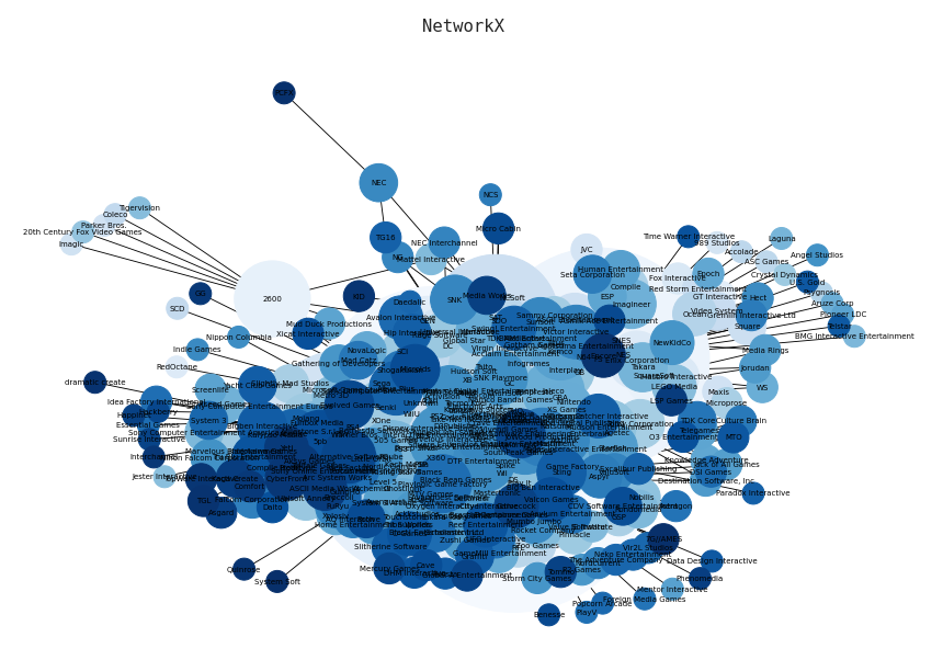
To create the network chart below, we start by filtering out the series that we want to visualise. We then create a list of edges, using NetworkX’s to_edgelist() method. Setting the colors variable is entirely optional, but I would recommend modifying the multiplying value within the node_size and width list comprehensions if the edges don’t show (try * 50 and re run the function).
Thanks for reading!