JoyPy, a Matplotlib Wrapper for Ridgeline Plots
Visualising the distribution of a given variable within a dataset is both extremely useful, and pretty simple. Whether you choose Python, R, Julia, Excel, or whichever language / framework you want to, creating a violin plot is probably one of the first things you will learn and then iterate over when working with numerical data.
Ridgeline, or joy plots?
Where things can get a bit more complicated, is when trying to compare the density of numerous variables. And by numerous, I mean dozens. Imagine for instance that you want to output and compare for any given country the distribution of rainfall or temperatures for each year, starting in 1900. You will end up with 100+ individual years of distributed data, and using multiple side-by-side violin plots will likely rapidly be very messy if not impossible to read.
Actually, both names are perfectly valid. At a high-level, a ridgeline (or joy) plot really is a violin plot, cut down in half, and pivoted on an horizontal axis. Each variable gets its own plot, which are then stacked onto one another and share as a common x-axis the range of the numerical data that they.
JoyPy
Funnily enough, creating a ridgeline plot in either Matplotlib or Seaborn isn’t as simple as you might think it is. You will find multiple examples across websites like StackOverflow, or direcly on the official Matplotlib and Seaborn websites, but there doesn’t seem to be any simple and ready-to-use solution as of July 2020.
Or is there? Well, JoyPy is a very useful library for Python that literally only has one method: .joyplot().
Not only is JoyPy easy to use, but its author has also shared a great notebook that shows all the different parameters that can passed into the .joyplot() method, and to what extent they affect the rendering of the charts.
How does it work?
We first need some data, and rather than looking for an existing dataset online, we can just assemble multiple arrays of random integers into a Pandas dataframe.
import numpy as np
import pandas as pd

def getDataFrame():
    df = pd.DataFrame(
        np.random.randint(0,100,size=(100, 12)),
        columns=list("ABCDEFGHIJKL")
        )
    return df

df = getDataFrame()
df
Note: we could also use string.ascii_uppercase for the name of the series
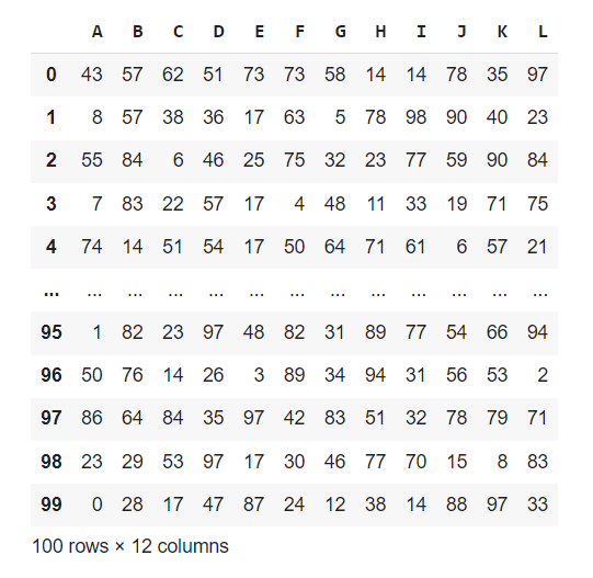
And we get this nice dataframe that will be just perfect for what we are trying to do today.

If you don’t have the JoyPy library installed on your device yet, you can simply pip or conda (better) install it as follows:
pip install joypy
We’re ready to go! Importing some Matplotlib dependencies is entirely optional, but will come in handy when tweaking the overall look and feel of the plots.
import joypy
import pandas as pd
from matplotlib import cm
from matplotlib import style
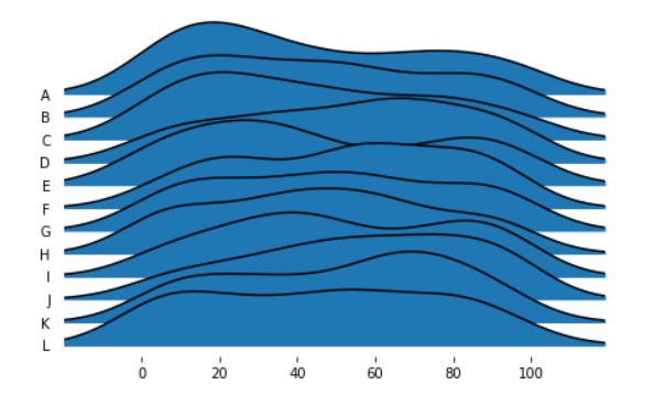
Remember earlier in this article when I mentioned how easy it was to use JoyPy? We can write a single line of code, and get some arguably decent results already:
fig, axes = joyplot(df)

Easy to customize
Ok, this is far from being perfect: the lines haven’t been scaled by color, the figure is too small, the plot is missing a title, etc.. But it’s close to what we want ideally want to get. Let’s see how we can improve this first chart!
def getJoyPlot(data,title):
    fig, ax = joyplot(
              data=data,
              figsize=(15,10),
              colormap=cm.magma,
              tails=0.2,
              overlap=0.3,
	      linewidth=3,
              fade=True,
              bins=30,
              title=title
                );

getJoyPlot(df,"Distribution comparison")

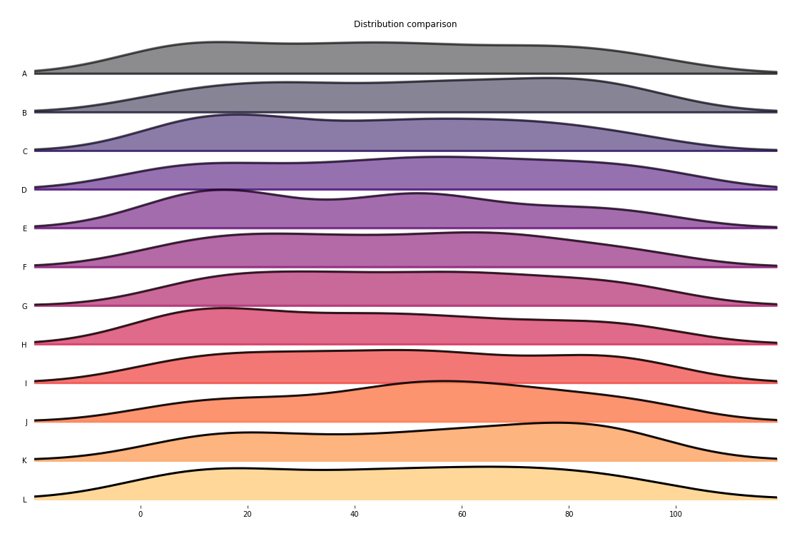
Now, that looks much better! So what has changed between our first chart and this improved one?:
- We have created a custom figure size, using the
figsize()parameter from Matplotlib. - We have also assigned a colormap to our horizontal ridge lines. You can find a full list of supported colormaps here.
- As don’t want values located within the tails of each line to skew the overal density of each segment, we passed a
0.2value to thetailsparameter. - By setting the
overlapvalue to0.3, we are allowing the highest densities to overlap with the ridge lane that is directly above them. This makes the whole figure a bit more compact, and allows for easier visualisation. - The
linewidthparameter has been set to3, which thickens the black line that shapes the density of each line. - Finally, by setting an immutable range of
bins=30, we are allowing us to add in an extrahist=Trueparameter if we choose to (not shown in the example above).
If you think that you could benefit from using JoyPy, I again highly recommend you to read through the very comprehensive Jupyter notebook that its author wrote.