Danfo.js and Dnotebook, a Pandas / Jupyter Combo for JavaScript
An example of what we’ll be doing in this article
If I had the money to make a very opinionated John Carmack-like bet, I would probably wager that the future language of choice for data science is going to be none other than JavaScript.
Jeff Atwood’s Law
If you’re a frequent reader of this blog, you are probably pretty familiar with either Python, R, Matlab, or Julia. And yet as mentioned earlier, I think that the programming language you should really start investing some time into is JavaScript. Its ecosystem already has some very powerful libraries for data visualisation, natural language processing, and even machine learning.
Yet, as a data practitioner who wants to dabble in any of the above, what you need first is a robust data transformation and analysis toolkit. Think of Pandas, Apache Arrow, Dplyr, or DataFrames.jl, depending on what framework or language you’re into. The good news is, there already exist quite a few Node.js packages that can be used for manipulating tabular data, the most popular ones being:
So why pick Danfo.js over any of the aforementioned solutions? Well because, to quote its authors, Danfo.js’s syntax is pretty close to that of Pandas, which in itself is arguably a big plus:
Danfo.js is heavily inspired by the Pandas library and provides a similar interface and API. This means users familiar with the Pandas API can easily use Danfo.js.
Now obviously, there are a few other reasons why today’s article focuses on Danfo.js specifically, as it:
- Features native support for tensors, and therefore for TensorFlow.js
- Comes with its own free Jupyter-inspired notebook solution (Data-Forge JS also comes bundled with a similar-looking notebook environment)
- Provides a very comprehensive and well-written documentation, with plenty of practical examples
- Came from a duo of developers who wrote and published an entire book about stheir library, which I have purchased and based myself on to write this article
- Can easily output in-browser plots and tables.
- Provides native support for Plotly.js (which is also the case for Arquero)
That being said, I must also be transparent and admit that I personally haven’t spent enough time exploring what the three other data manipulation packages have to offer.
A promising library
Before we delve into the actual code, please note that we’ll be using the following two datasets, that you can find directly on my GitHub page:
- Around a year worth of close prices for the five Big Tech companies’ stocks
- A collection of 700+ Covid-related news articles headlines, all scraped from an online Irish news site named The Journal.ie
We’ll be referring to them as follows:
let dataset_stocks = "https://github.com/julien-blanchard/dbs/blob/main/Stocks%20-%20Sept%202022.csv";
let dataset_news = "https://raw.githubusercontent.com/julien-blanchard/dbs/main/df_journal.csv";
Alright, so now that we have some data to play around with, let’s see how we can turn these two .csv files into dataframe objects. Regardless of whether you want to work with Node.js applications or run a script from an HTML file, creating a dataframe should roughly look like this:
const getDataframe = (csv_file) => {
      dfd
        .readCSV(csv_file)
        .then(
          df => df)
          .whatever_method_we_want_to_apply_here
        )
      };

getDataframe(either_of_the_aformentioned_two_datasets)
If you’re coming from a language like Python, you might find this a little bit odd and be tempted to rewrite the function as follows:
const getDataFrame = (csv_file) => {
   dfd.readCSV(csv_file)
      .then( d => let dataframe = d )
   return dataframe

let df = getDataFrame(either_of_the_aformentioned_two_datasets)
However, the code above won’t return anything. Or rather, it’s going to tell you that that your dataframe isn’t defined. I would in this case invite you to read a bit more about the concept of JavaScript promises: long story short, they allow what you write to run asynchronously. This means that the code outside of your promise constructs (then, catch) can execute while the promise is waiting to be resolved. In other words, if you try to use a variable outside of the promise constructs, it simply won’t have any value yet. In our case the dataframe object isn’t defined because it’s not in scope outside of the then. Actually, even if it was, it still wouldn’t have what we’re looking for because it would run before the then statement gets executed.
Instead, if you want to keep a Python-like syntax, you can simply use async / await and process the dataframe within the async function:
async function getDataFrame(csv_file) {
        let df = await dfd.readCSV(csv_file);
        df.whatever_method_we_want_to_apply_here;
      }

getDataFrame(either_of_the_aformentioned_two_datasets)
Either way, congratulations, you have just created your first dataframe!
BNN: Browser, Node, Notebook
There are currently three main ways to work with Danfo.js:
- Node.js:
If you’re building an application and you want to be able to easily manipulate and transform some tabular data that you have, simply start by npm install-ing the danfojs-node (for Node) or the danfojs (for frameworks like React, Vue, Next.js, etc..) package depending on what you intend to work with.
We’ll then need to make some slight changes to the original function we wrote earlier, by appending the print() method to our dataframe object:
const dfd = require("danfojs-node")

async function getAsyncDataFrame(csv_file) {
    let df = await dfd.readCSV(csv_file);
    df.head().print()
}

getAsyncDataFrame(dataset_news);

If you’re coming from Pandas or Dplyr, what the .head() method does should be pretty familiar to you.
- In-browser usage:
As of October 2022, the most recent version of Danfo.js is 1.1.0, and we’ll first need to insert the following line of code into the HTML <head> tags:
<head>
    <script src="https://cdn.jsdelivr.net/npm/danfojs@1.1.0/lib/bundle.min.js"></script>
</head>
Outputting a dataframe object, or a chart (we’ll get to that later), will require from us to create a <div> and specify its id attribute:
<body>
  <h2>In-browser dataframe with Danfo.js</h2>
  <div id="plot_div"></div>
</body>
Still within the <body> tags, we can now reuse the exact same function that we called earlier on when working with Node.js. However, instead of using the .print() method, we’re first going to pass the id attribute for the <div> tag into a .plot() method, and then specify what type of plot we want to create. In this case a table, but I’m sure you’ve already guessed that at a later point we’ll be creating actuall charts using the .bar() or .line() methods instead.
<script>
    let dataset_news = "https://raw.githubusercontent.com/julien-blanchard/dbs/main/df_journal.csv";

    async function getAsyncDataFrame(csv_file) {
        let df = await dfd.readCSV(csv_file);
        df.head().plot("plot_div").table();
    }
    getAsyncDataFrame(dataset_news);
</script>

- DNotebook:
As briefly discussed in one of the first paragraphs of this article, the authors of Danfo.js have also created DNotebook, a simple Jupyter-inspired notebook solution, that I must say I have mixed feelings about.
When running the dnotebook command for the first time, we are given a localhost address that we can then paste into the navigation bar of our favourite browser (here, Firefox):

The load_package() method replaces our usual import in Python, one caveat being that as far as I’m aware, it is not yet possible to alias the libraries that we load onto the environment.
load_package(
  [
    "https://cdn.jsdelivr.net/npm/danfojs@0.2.4/dist/index.min.js"
  ]
)
By the way, pretty much any package that is on the JSDelivr content delivery notework can be imported. See below for instance how we can add both TensorFlow.js and Charts.js to the array where the Danfo.js package sits:
load_package(
  [
    "https://cdn.jsdelivr.net/npm/@tensorflow/tfjs@latest",
    "https://cdn.jsdelivr.net/npm/danfojs@0.2.4/dist/index.min.js",
    "https://cdn.jsdelivr.net/npm/chart.js",
    "https://cdn.jsdelivr.net/npm/chart.js@3.9.1/dist/chart.min.js"
  ]
)
The next steps are slightly different from what we have done so far. Moving over to the next cell, we’re still going to create a variable for our dataset but this time we’ll have to pass it through a new method called load_csv(). Our getAsyncDataFrame() function is gone, and .print() / .plot() have been replaced with .table().
let dataset_news = "https://raw.githubusercontent.com/julien-blanchard/dbs/main/df_journal.csv";

load_csv(dataset_news)
    .then( (datatable) =>  {df = datatable}
         )

table(df.head())

Now, I would strongly recommend being cautious when using Dnotebook for anything other than testing purposes, as I encountered multiple issues when trying to save my work and download the notebook onto my local machine. As you can see from the screenshot below, the available options are quite limited and I found the auto-save feature unreliable.
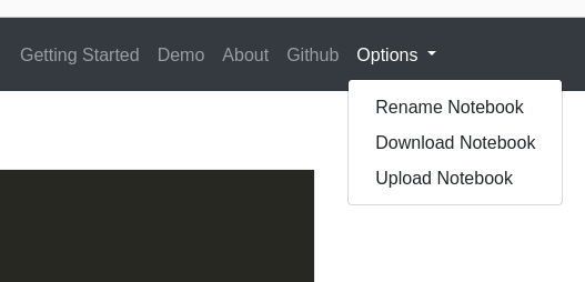
This is my only real gripe with DNotebook, as I had otherwise thoroughly enjoyed playing around with it before losing an entire hour of work.
Pandas anyone?
That being said, this has pretty much been the only downside in my whole experience working with Danfo.js. And as the library matures, I’m sure that issues like that one are likely to disappear, making the whole experience even more enjoyable. Besides, using DNotebook is, after all, entirely optional.
Back to our original topic, I wrote earlier on that one of the main reasons why you should use Danfo.js is its similarity with Pandas. And if you’re coming from Python, the following dataframe object methods are shared across both libraries and should therefore hold no secret to you:
.head().tail().describe().loc().rename().groupby()sortValues()(here, slight syntax difference)
And the list goes on! If you want to see more overlapping methods between the two libraries, I strongly encourage you to take a look at Danfo.js’s official documentation and see for yourself.
Basic features
We’re now going to focus on some basic data manipulation that an analyst will likely be required to perform on a daily basis. We’re talking about common tasks like slicing data, aggregating values, and creating simple charts.
- Selection
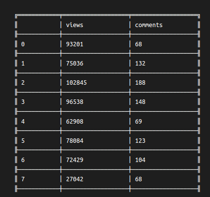
Remember the .loc() method that we saw earlier on? To access a selection of series within a dataframe, all we have to do is pass a JavaScript object as a parameter within the .loc() method:
async function getAsyncDataFrame(csv_file) {
    let df = await dfd.readCSV(csv_file);
    df
        .loc( {columns: ["views","comments"]})
        .print()
}

getAsyncDataFrame(dataset_news);
To filter out the dataframe by some specific values, we can simply change columns: to rows:, and add some conditional filters such as gt (greater than) or lt (less than). Besides, the .query() method can also be used (please note that .query() is one of the few examples of something implemented in Danfo.js that vastly differs from its Pandas’s counterpart):
async function getAsyncDataFrame(csv_file) {
    let df = await dfd.readCSV(csv_file);
    df.loc({ rows: df["Meta"].gt(370) }).print()
}

getAsyncDataFrame(dataset_stocks);

- Aggregation
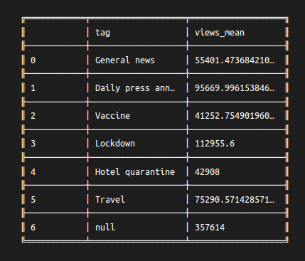
Performing a SQL-like GROUPBY takes a chain of three methods:
.groupby(), which can contain one or more series- and
.col()which can also contain one or more series - The type of aggregation is specified last, and you can find the whole list of available calculations here (in our case,
.mean())
async function getAsyncDataFrame(csv_file) {
    let df = await dfd.readCSV(csv_file);
    df
        .groupby(["tag"])
        .col(["views"]).mean()
        .print()
}

getAsyncDataFrame(dataset_news);
- Method chaining
Method chaining makes good use of the fact that JavaScript (and Python) ignores spacing and new lines for any code that is written between parentheses. Though method chaining isn’t fundamentally new, I highly recommend you to watch some of Matt Harrison’s videos if you want to know more.
async function getAsyncDataFrame(csv_file) {
    let df = await dfd.readCSV(csv_file);
    df
        .loc({columns: ["tag","views"]})
        .groupby(["tag"])
        .col(["views"]).mean()
        .dropNa({ axis: 0 })
        .sortValues("views_mean", {ascending:false})
        .rename({"views_mean":"volume"})
        .print()
}

getAsyncDataFrame(dataset_news);

In the code above, we selected two series, grouped them by "tag" and the mean values of "views". This aggregated serie was automatically named "views_mean". We then dropped any NULL values, sorted the dataframe by this newly created series, and finally renamed it to "volume".
Plotly support
We saw earlier on how to output a dataframe onto an HTML page, using the .plot() method and specifying what type of visualisation we wanted. More specifically, we generated a .table() object:
df.head().plot("plot_div").table()
What actually happened in the background is that Danfo.js didn’t create an HTML <table> at all, but used Plotly’s table chart functionality instead.
The good news here, is that as the table we created was in reality just a plain a chart, producing different visualisation types will logically be as simple as changing the .table() method to anything we want to. Let’s see for instance how we can reuse our chained aggregation function to output a simple bar plot!
let dataset_news = "https://raw.githubusercontent.com/julien-blanchard/dbs/main/df_journal.csv";
    async function getAsyncDataFrame(csv_file) {
      let df = await dfd.readCSV(csv_file);

      const config = {
          x: "tag",
          y: "volume"
      }

      df
          .groupby(["tag"])
          .col(["views"]).mean()
          .sortValues("views_mean", {ascending:false})
          .rename({"views_mean":"volume"})
          .plot("plot_div").bar( {config} )
        }

    getAsyncDataFrame(dataset_news);
Provided that we have a <div> tags with its id= attribute set to "plot_div", we should see the following bar plot when refreshing our page:

As you have probably noticed, we had to create an object named config in order to specify the x and y axis, though doing so is only optional.
As of October 2022, Danfo.js officially supports:
- Line charts
- Bar charts
- Scatter plots
- Histograms
- Pie charts
- Tables
- Violin plots
- Timeseries plots
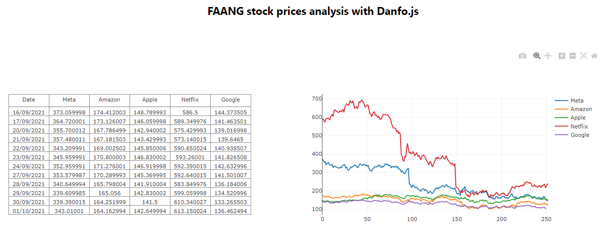
Let’s now see how to combine several elements to produce a side by side table and line charts, and get some dashboard-like visualisations.
First, we’re going to need an HTML file with a simple <div> and a class= attribute set to "container. Nested within this wrapper <div> will be two new <div> tags, with distinct id= attributes:
<body>
    <header>
      <section>
        <h1>FAANG stock prices analysis with Danfo.js / test</h1>
      </section>
    </header>
    <div class="container">
      <div id="data"></div>
      <div id="plot"></div>
    </div>
</body>
Then, we create a separate style.css file and paste the following two lines of code into it:
.container {
    display: flex;
}
Finally, still within the <body></body> tags we write two seperate functions, a first one to call a .table() chart and a second one that will output a line() plot for the stock values:
let stocks = "https://raw.githubusercontent.com/julien-blanchard/dbs/main/Stocks%20-%20Sept%202022.csv";

async function getDataFrame(csv_file,where) {
    let df = await dfd.readCSV(csv_file);
    df.plot(where).table();
  }

async function getBarPlot(csv_file,where) {
    let df = await dfd.readCSV(csv_file);
    const config = {
      columns: ["Meta","Amazon","Apple","Netflix","Google"],
      displayModeBar: true,
      displaylogo: false,
    };
    df.plot(where).line({ config });
  }

getDataFrame(stocks,"data")
getBarPlot(stocks,"plot");

These charts arguably look pretty basic, but nothing prevents us from using a more powerful data visualisation package, like AnyChart or VegaLite.
Final thoughts
Though the purpose of this article definitely wasn’t to show advanced examples of data manipulation, or even how to leverage TensorFlow.js and perform some time series forecasting, I hope it helped showcase how intuitive and useful a library like Danfo.js can be.
As discussed in the introduction, I strongly believe that JavaScript has the potential to become a great language for data analysts and scientists alike, but that it unfortunately suffers from its reputation of having a messed up ecosystem as well as for being a language whose only purpose is web development.
Obviously, packages like Danfo.js will need to gain a bit more popularity before they can pretend to compete with more mature solutions like Pandas or Dplyr, but they do have a strong potential and will continue to improve as their userbase grows.
Ideally, I could see this happen through an integration within the Jupyter notebook environment, and the support of popular online resources like Towards Data Science or Aanalytics Vidhia to name a few.
If you liked this article, feel free to drop me a message, and don’t forget to give Danfo.js a try!