Arquero: A Great Dataframe Toolkit for JavaScript
An example of what we’ll be doing in this article:
Most open positions for data related jobs on any popular employment website will likely list Python or R as the languages that applicants must be skilled in. But hey, nobody leaves JavaScript in the corner!
Data manipulation packages for the Node ecosystem have grown a lot over the past three or four years, to a point where they have become a credible alternative to using more popular Python or R based libraries such as Pandas or Dplyr.
Why Arquero
As of April 2023, the landscape of data wrangling in JavaScript pretty much consists of the three following packages:
- Danfo.js (check out my article here)
- Tidy.js
- Data-Forge
At least for now. I recently listened to a podcast from Talk Python where the author of Polars mentioned that a version of his Rust-based data manipulation library was being developed for the JavaScript ecosystem. As you might be aware of, Polars is blazingly fast, so why not just wait for the new king of data to make its way to npm?
First, arquero is the Spanish word for arrow, and I guess most of you dear readers already see where I’m headed to. Yeah, just like Polars, just like Pandas 2.0., Arquero offers support for Apache Arrow. And that’s a pretty big thing. Unless you haven’t been following tech forums lately, you should be aware that Apache Arrow-based solutions are probably going to take over the world within the next couple of years.
Now if you’re really not familiar with what we’re talking about, I highly recommend checking this video from Rob Mulla, and his whole channel in general:
Ok so, it’s fast. But then what? I’ll simply add that Arquero feels to me like the easiest place to start with if you want to be doing data manipulation in your browser or within a web application. Provided that you are already familiar with arrays, objects, and basic asynchronous concepts, you should have no issue learning the ins and outs of this package in just a few days.
Oh while we’re there: from a more practical aspect, another feature that I think makes Arquero stand out from the crowd, is that it offers two ways of outputting your rows and columns:
.print()will print the dataframe to the console. This is useful for Node.toHTML()will format the dataframe as an html table string, which as we will see in a minute makes integrating your dataframes into a web app much easier
The basics
So how do we create a simple dataframe? If like me you’re coming from Python, you’re then probably familiar with the following syntax:
import pandas as pd

d = {
  "Name": ["Tomato", "Apple", "Lemon"],
  "Price": [3,4,2],
  "Color": ["Red","Green","Yellow"]
}

df = pd.DataFrame(d)
df
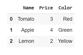
Where the keys and values pairs respectively become the serie names and values. Well I have some good news for you: the same logic also applies to Arquero:
const d = {
  Name: ["Tomato", "Apple", "Lemon"],
  Price: [3,4,2],
  Color: ["Red","Green","Yellow"]
}

const getTable = (data) => {
  const dframe = aq.table(data)
  console.log(dframe.print())
}
getTable(d);

Right, that’s pretty cool. But let’s be honest: we’re probably not going to manually create a dataset each time we need to explore some features or run a model. Especially if we’re working with hundreds of thousands of rows, and interacting with a SQL databse. Unless you’re fetching your data from an API, there’s a high chance that you’ll be working with some good old tabular data instead.
There are multiple ways to open an online csv file in JavaScript, mostly depending on whether you’re operating from Node or directly within your browser. As we’ll be creating a simple website in the next chapter, let’s start with Node. I personally like to use D3’s .csv() method: it’s fast, it’s reliable and easy to both implement and debug.
Once you have initialized your Node environment, either npm install D3, or use a content delivery network:
const d3 = require("d3");
const aq = require("arquero");
I uploaded a very basic csv file onto my GitHub account, that contains some random data that I created in Python using the Faker library:
from faker import Faker
import random
import pandas as pd

fake = Faker()

def getDataFrame(howmany):
    data = {
        "First_name": [fake.first_name() for _ in range(0,howmany)],
        "Last_name": [fake.last_name() for _ in range(0,howmany)],
        "Age": [random.randint(18,57) for _ in range(0,howmany)],
        "Country": [fake.country() for _ in range(0,howmany)],
        "Occupation": [fake.job() for _ in range(0,howmany)]
    }
    result = pd.DataFrame(data)
    return result

df = getDataFrame(200)
df.to_csv("/content/drive/My Drive/fake_csv.csv",index=False)

Let’s go ahead and assign our dataset to a variable named file_to_open:
let file_to_open = "https://raw.githubusercontent.com/julien-blanchard/datasets/main/fake_csv.csv";
D3’s .csv() will return a promise, and the content of our csv file as an object:
const fetchData = (data) => {
  return d3.csv(data).then(csv_data => {
    console.log(csv_data);
  })
}
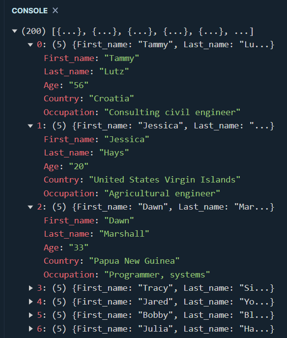
To turn this object into another object that we can later use to create an Arquero table, all we have to do is loop through the values of our first object and pass these values into some predefined arrays:
const fetchData = (data) => {
  return d3.csv(data).then( csv_file => {
    let struct = {
      First_name: [],
      Last_name: [],
      Age: [],
      Country: [],
      Occupation: []
    };

    for (let c in csv_file) {
      let columns = Object.values(csv_file[c])
      struct["First_name"].push(columns[0])
      struct["Last_name"].push(columns[1])
      struct["Age"].push(columns[2])
      struct["Country"].push(columns[3])
      struct["Occupation"].push(columns[4])
    }
    return struct;
  })
}
Now that we have an object in the right format, we simply have to write a second function that creates a table and output its first five rows:
const getData = async () => {
  const data = await fetchData(file_to_open);
  let df = aq.table(data);
  df.print({limit: 10});
}

getData();
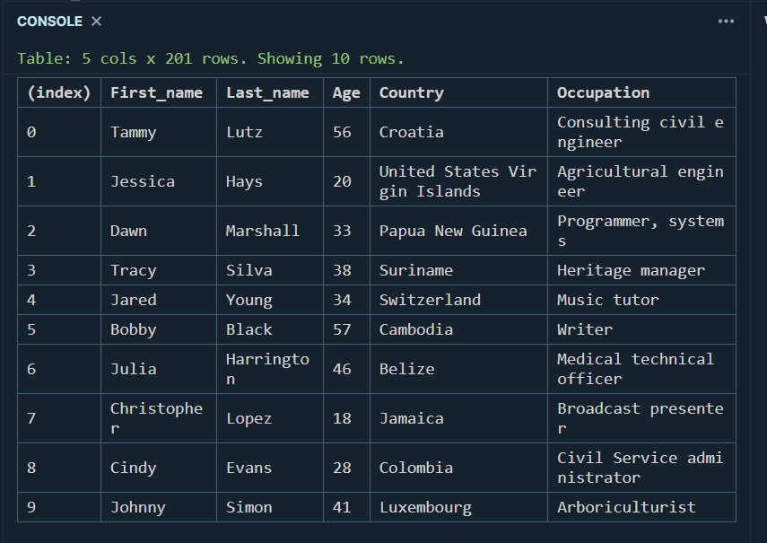
That’s indeed pretty straightforward, right?
Now, as the purpose of this article isn’t to do a deep dive into all the functionalities that Arquero has to offer, we’ll only be looking at some of its most basic features. For more complex operations, please refer to the official documentation, which is really well-written and provides a lot of examples that will help you get ramped up quickly.
- Renaming columns is really simple:
const getData = async () => {
  const data = await fetchData(file_to_open);
  let df = aq.table(data);
  df
  .rename( {
    First_name: "f",
    Last_name: "l",
    Age: "a",
    Country: "c",
    Occupation: "o"
    } )
  .print({limit: 10});
}

getData();
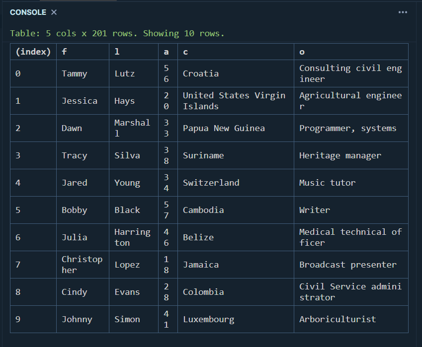
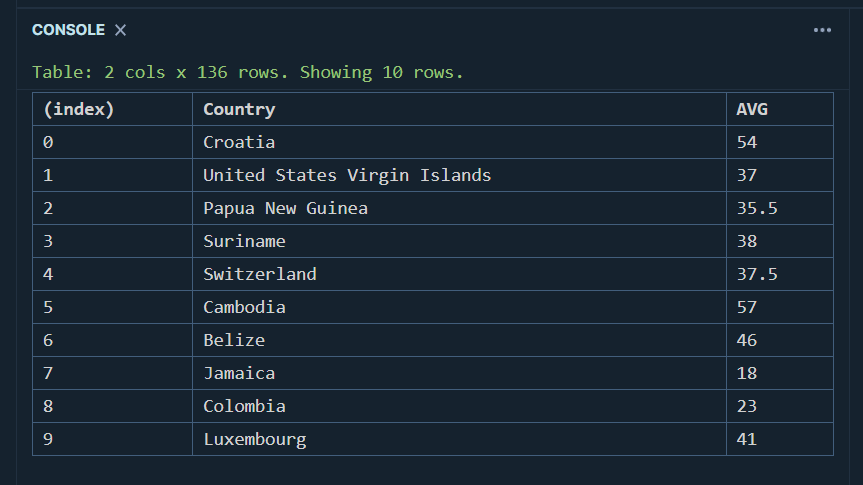
- Aggregating is achieved using the op module, which is pretty straightforward I think:
const getData = async () => {
  const data = await fetchData(file_to_open);
  let df = aq.table(data);
  df
  .groupby("Country")
  .rollup({
    AVG: (d) => op.mean(d.Age)
  })
  .print({limit: 10});
}

getData();
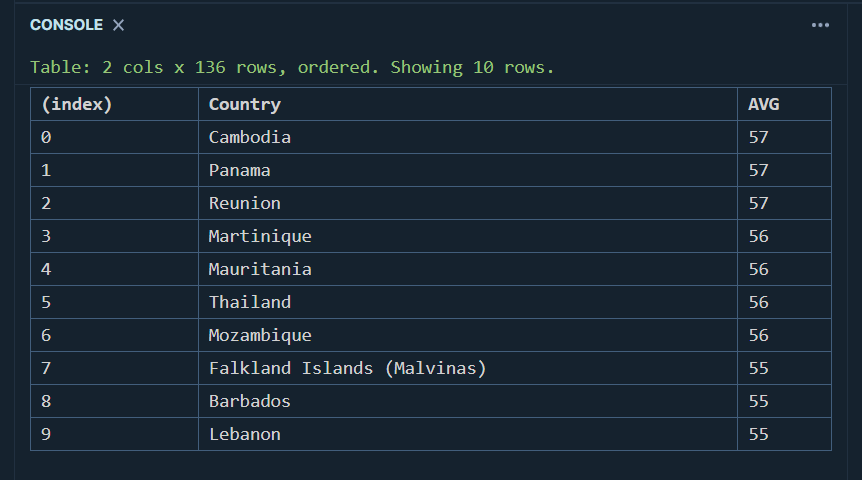
- And we can then sort our dataframe object using the
orderby()method:
const getData = async () => {
  const data = await fetchData(file_to_open);
  let df = aq.table(data);
  df
  .groupby("Country")
  .rollup({
    AVG: (d) => op.mean(d.Age)
  })
  .orderby(aq.desc("AVG"))
  .print({limit: 10});
}

getData();
- Finally, we can apply some filters to our table and even chain them if necessary:
const getData = async () => {
  const data = await fetchData(file_to_open);
  let df = aq.table(data);
  df
  .filter( (d) => d.Country === "Cambodia")
  .print({limit: 10});
}

getData();

Now that we know how to perform some basic operations, let’s head over to a real-life example.
Practical application: creating a website from scratch
What we’re going to do here is quite simple: we want a basic website that allows its users to retrieve recent stock prices for any ticker, and visualize this data through both a table and a line chart.
As I’m absolutely not a web developer, I’ll be using Bulma, an open-source css framework that is going to take care of all the website layout for us. Let’s start by creating an html file and paste the following lines of code into it:
<head>
    <meta name="viewport" content="width=device-width, initial-scale=1">
    <meta charset="UTF-8">
    <meta http-equiv="X-UA-Compatible" content="IE=edge">
    <link rel="stylesheet" href="https://cdn.jsdelivr.net/npm/bulma@0.9.4/css/bulma.min.css">
    <link rel="stylesheet" href="https://cdnjs.cloudflare.com/ajax/libs/font-awesome/6.2.1/css/all.min.css">
    <script src="stocks.js" defer></script>
    <script src="https://cdn.jsdelivr.net/npm/apache-arrow@latest"></script>
    <script src="https://cdn.jsdelivr.net/npm/arquero@latest"></script>
    <script src="https://cdn.jsdelivr.net/npm/apexcharts"></script>
    <title>Stock prices</title>
</head>
As you can see, we’re also loading the Apache Arrow package that we discussed earlier on in this article. By the way, importing Font Awesome is absolutely optional, but we’ll be using some nice emojis to make our website a bit prettier. Next, simply paste the following <body> tags right into the html file:
<body>
  <section class="section">
        <div class="container">
            <div class="block">
                <h1 class="title">
                    Stock prices
                  </h1>
            </div>
            <div class="block">
                <p class="subtitle">
                    Visualising and forecasting stock prices with <strong>JavaScript</strong>
                  </p>
            </div>

            <div class="field is-grouped">
              <p class="control has-icons-left">
                <input class="input" id="api_key" type="text" placeholder="Enter your API key">
                <span class="icon is-small is-left">
                  <i class="fa-solid fa-key"></i>
                </span>
              </p>
              <p class="control has-icons-left">
                <input class="input" id="ticker" type="text" placeholder="Enter a ticker">
                <span class="icon is-small is-left">
                  <i class="fa-solid fa-sack-dollar"></i>
                </span>
              </p>
              <div class="select">
                <select id="choice">
                  <option>Dataframe</option>
                  <option>Line chart</option>
                  <option>Forecast</option>
                </select>
              </div>
            </div>

            <div class="field is-grouped">
              <p class="control">
                <a class="button is-info is-outlined" id="press_fetch">
                  <span class="icon">
                    <i class="fa-regular fa-circle-check"></i>
                  </span>
                  <span>Fetch</span>
                </a>
                <a class="button is-info is-outlined" id="press_clear">
                  <span class="icon">
                    <i class="fa-regular fa-trash-can"></i>
                  </span>
                  <span>Clear</span>
                </a>
              </p>
            </div>

        </div>
      </section>
      <section class="section">
        <div class="container">
          <table class="table is-striped is-hoverable table is-fullwidth" id="viz_df"></table>
          <div id="viz_plot"></div>
        </div>
      </section>
</body>
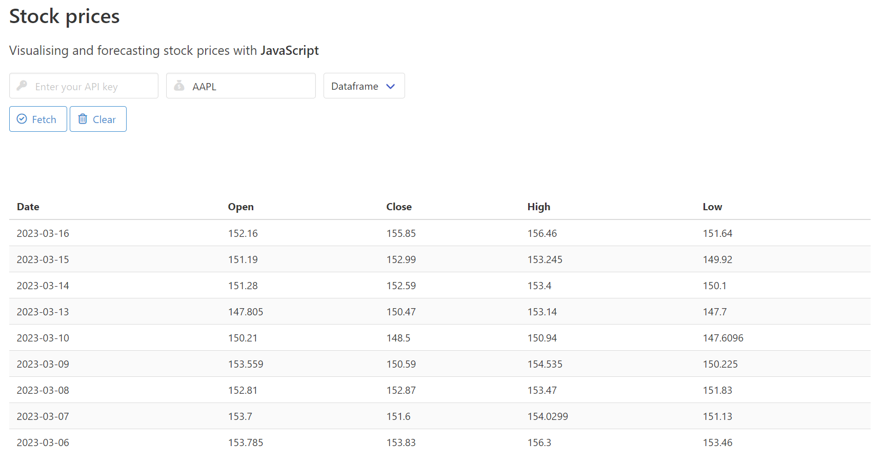
If everything went fine, we should normally see something like this:
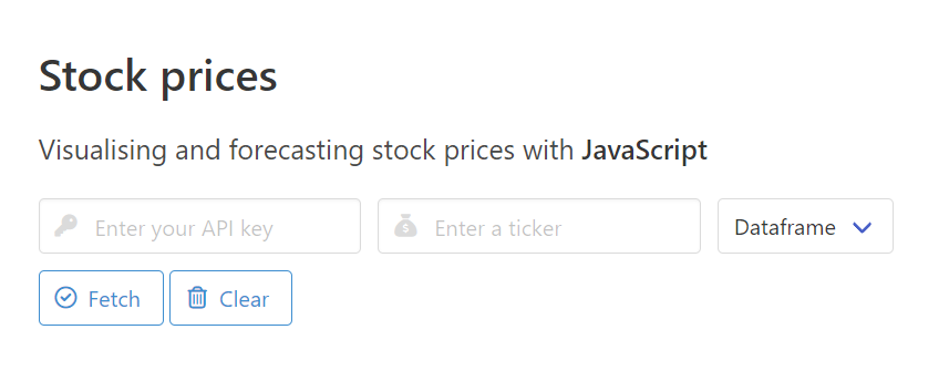
Alright, we now have a website. We can close this html page and create a new file that we’ll name script.js. Let’s first write a few variables that will help us interact with some of the elements that we built earlier:
let viz_df = document.getElementById("viz_df");
let viz_plot = document.getElementById("viz_plot");
let press_f = document.getElementById("press_fetch");
let press_c = document.getElementById("press_clear");
What we need next is some content. There’s a variety of finance APIs that can provide any sort of data that one can think of. But as all we’re trying to do here is showcase how easy it is to integrate Arquero into a web application, we’ll be using AlphaVantage’s free “TIME_SERIES_DAILY_ADJUSTED” API. To be fair, I’m already starting to regret this decision as I’m writing these lines: their free tier account seems limited to 5 requests per minute.
Anyway once we get our API key, we can write a simple function that retrieves a json object, which contains historical values for any ticker:
const fetchData = () => {
  const api_key = "***********";
  const ticker = "AAPL";
  const url = `https://www.alphavantage.co/query?function=TIME_SERIES_DAILY_ADJUSTED&symbol=${ticker}&apikey=${api_key}`;
  let request = new Request(url);
  return fetch(request)
  .then(req => { return req.json()})
  .then(result => {
    console.log(result)
  })
}
fetchData()
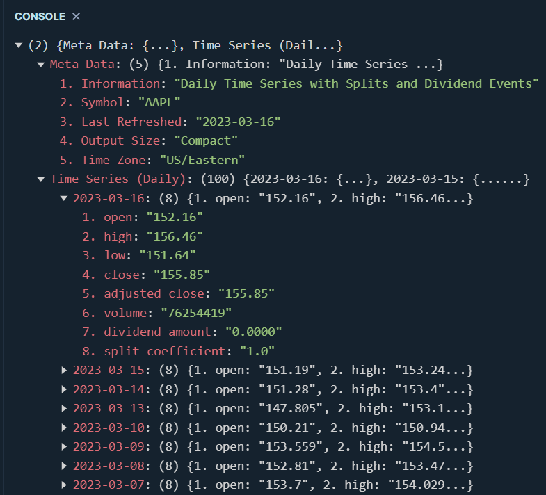
That being said, we don’t want to work with the overly complicated json object that AlphaVantage sends us. So what we need to do next, is find a way to convert all this data into a more simple object that we can then use to create an Arquero table. Here’s how we can do this:
const getPrices = () => {
    const url = "https://raw.githubusercontent.com/julien-blanchard/datasets/main/finance.json";
    let ticker = document.getElementById("ticker").value;
    let api_key = document.getElementById("api_key").value;
    //const url = `https://www.alphavantage.co/query?function=TIME_SERIES_DAILY_ADJUSTED&symbol=${ticker}&apikey=${api_key}`
    const request = new Request(url);
    return fetch(url)
    .then(req => {return req.json()})
    .then(result => {

        const struct = {
          "Date": [],
          "Open": [],
          "Close": [],
          "High": [],
          "Low": []
        }

        const data = result["Time Series (Daily)"];

        for (let d in data) {
          struct["Date"].push(d);
          struct["Open"].push(data[d]["1. open"]);
          struct["Close"].push(data[d]["4. close"]);
          struct["High"].push(data[d]["2. high"]);
          struct["Low"].push(data[d]["3. low"]);
        }

        return struct;
    })
}
As you can see, we have looped over the json object that AlphaVantage sent us and passed some of its values into a more simple object named struct. And here’s what this new struct object looks like:
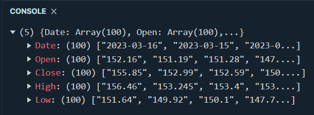
Now, if we wanted to render these values within our html file, we’d normally have to write a few more lines of vanilla JavaScript, or maybe use a framework such as jQuery:
Instead, we can achieve the same results in just two lines of code, using Arquero:
const getDataFrame = async () => {
    clearDataFrame();
    const df = await getPrices();
    viz_df.innerHTML =  aq.table(df).toHTML()
}

When we enter our API key and the ticker name “APPL”, we get this nice looking html table that you can see in the screenshot above. As discussed earlier Bulma has taken care of what the table looks like for our end users, and I personally really like the overall look and feel provided by this css framework. Now you might be wondering what the clearDataFrame() function does. Well, not much really. As its name suggests, it simply removes any existing content from our viz_df and viz_plot elements:
const clearDataFrame = () => {
    viz_df.innerHTML = "";
    viz_plot.innerHTML = "";
}
Remember the drop down list that we created at the very begining of this section when we built our html page? We’re going to be using these <select> tags to allow our end users to choose between our newly created “table” view, a line chart, and some time series forecasting (which we won’t be doing in this article):
const getChoice = () => {
  let choice = document.getElementById("choice").value;
  if (choice == "Dataframe") {
    getDataFrame();
  }
  else if (choice === "Line chart") {
    getLineChart();
  }
  else if (choice === "Forecast") {
    getForecast();
  }
}
We can then implement some very rudimentary event listeners to capture our users’ choice:
press_c.addEventListener("click", clearDataFrame);
press_f.addEventListener("click", getChoice);
Which leads us to the final part of this section, our line chart. There are literally tons and tons of frameworks and packages that we can use to create pretty much any visualisation that the human brain can think of. But for today’s article, we’ll be using ApexCharts. As its name suggests, it is one of the many existing charting libraries for the web, and it integrates well with any modern JavaScript web framework like React, Angular, Vue.js, etc."
We won’t be going into too much details as to how ApexCharts works, so for now all we need to define is the type of chart that we want, and our xaxis and series (yaxis) values:
const getLineChart = async () => {
    clearDataFrame();
    const df = await getPrices();
    var options = {
      chart: {
        type: "area"
      },
      series: [{
        name: "Close price",
        data: df["Close"]
      }],
      xaxis: {
        categories: df["Date"]
      },
      stroke: {
        width: 5,
        curve: "smooth"
      }
    }

    var chart = new ApexCharts(document.querySelector("#viz_plot"), options);

    chart.render();
}
Using the exact same API key and ticker (“AAPL”) but this time selecting line chart, our Arquero table disappears and is replaced by this cute looking plot:
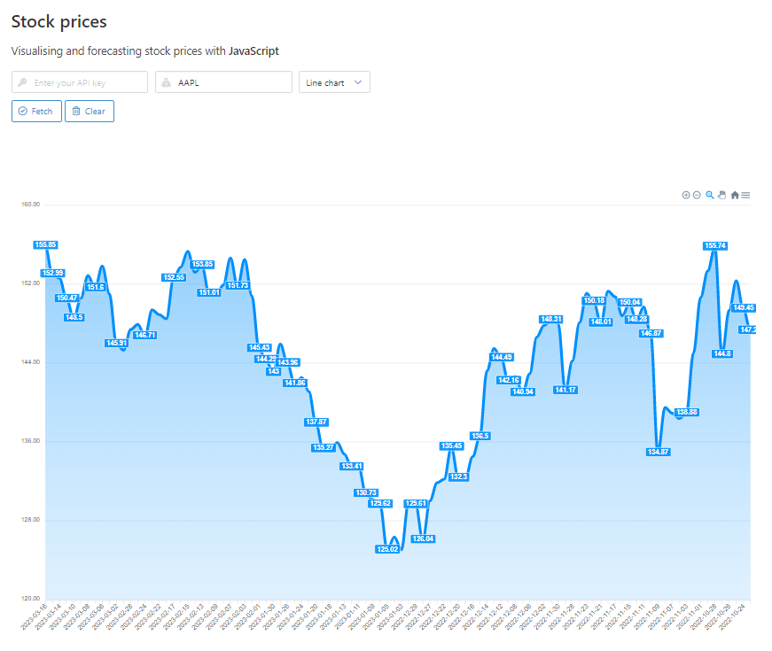
Nice!
Practical application: notebooks with Starboard
That’s all fine, but we’re data people, not web developers! So how can we use Arquero, or any similar data wrangling library, within a JavaScript*-friendly Jupyter-like notebook environment?
Regardless of whether you are a data scientist, data analyst, or anything that comes close to these two roles, you need a development environment that helps you explore data sets, test code and build algorithms. I personally am a big fan of Google Colab, but there are tons of options out there for you explore.
Well dear readers, please allow me to introduce you to Starboard. It’s free, it has a clean interface, and it offers the ability to combine code with HTML and Markdown just like you would expect from any Jupyter-inspired notebook environment. Starboard can support Python, JavaScript, and TypeScript, and it’s pretty easy to switch to JavaScript / Node directly within the IDE.
To get started, let’s head over to https://starboard.gg/ and set up an account:
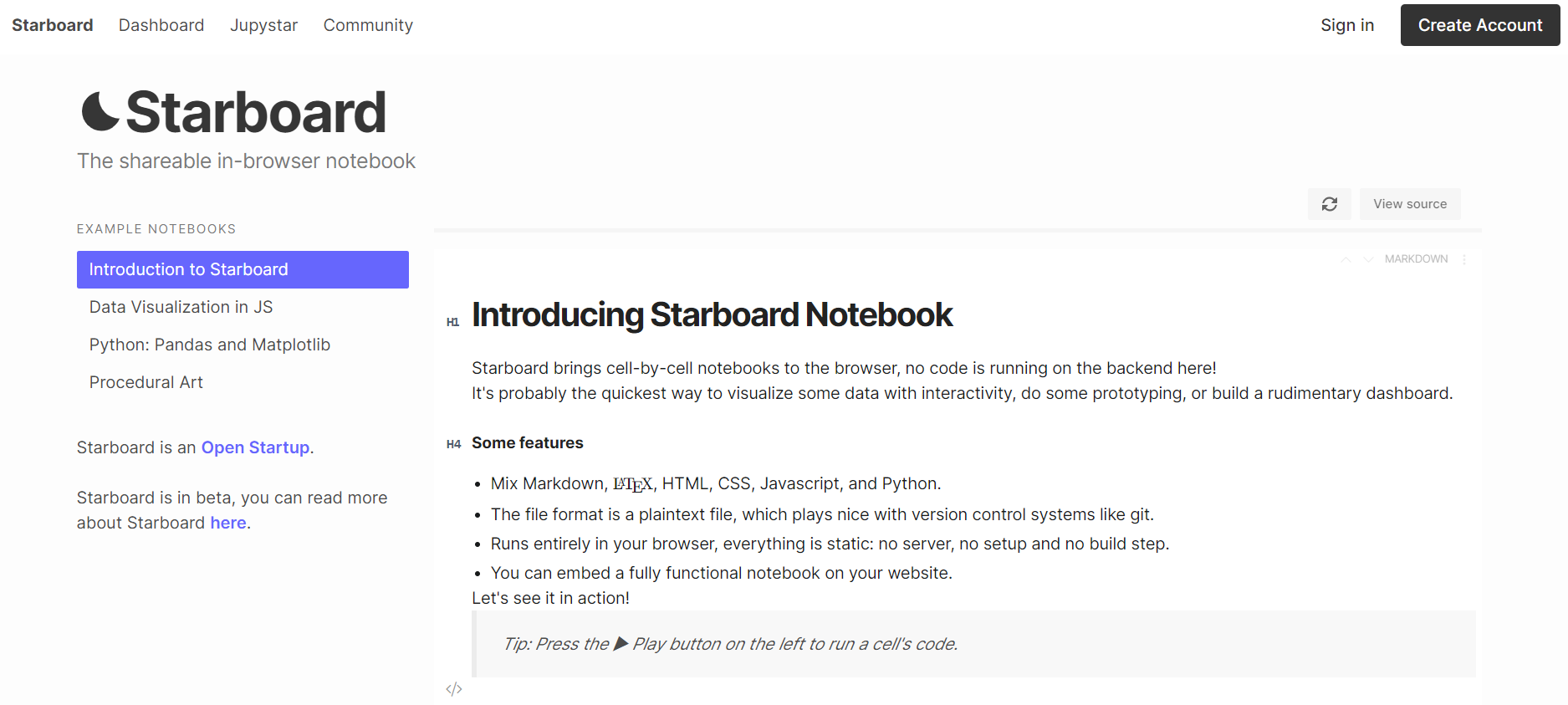
We’re met with a typical notebook interface, except that we seem to have different cell type options:
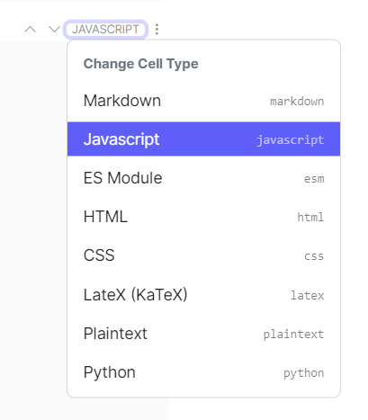
For now, let’s just select JAVASCRIPT and paste the following code into our newly created cell:
await import("https://cdn.jsdelivr.net/npm/arquero@latest")

const d = {
  Name: ["Tomato", "Apple", "Lemon"],
  Price: [3,4,2],
  Color: ["Red","Green","Yellow"]
}

const getTable = (data) => {
  const dframe = aq.table(data)
  console.log(dframe.print())
}
getTable(d);
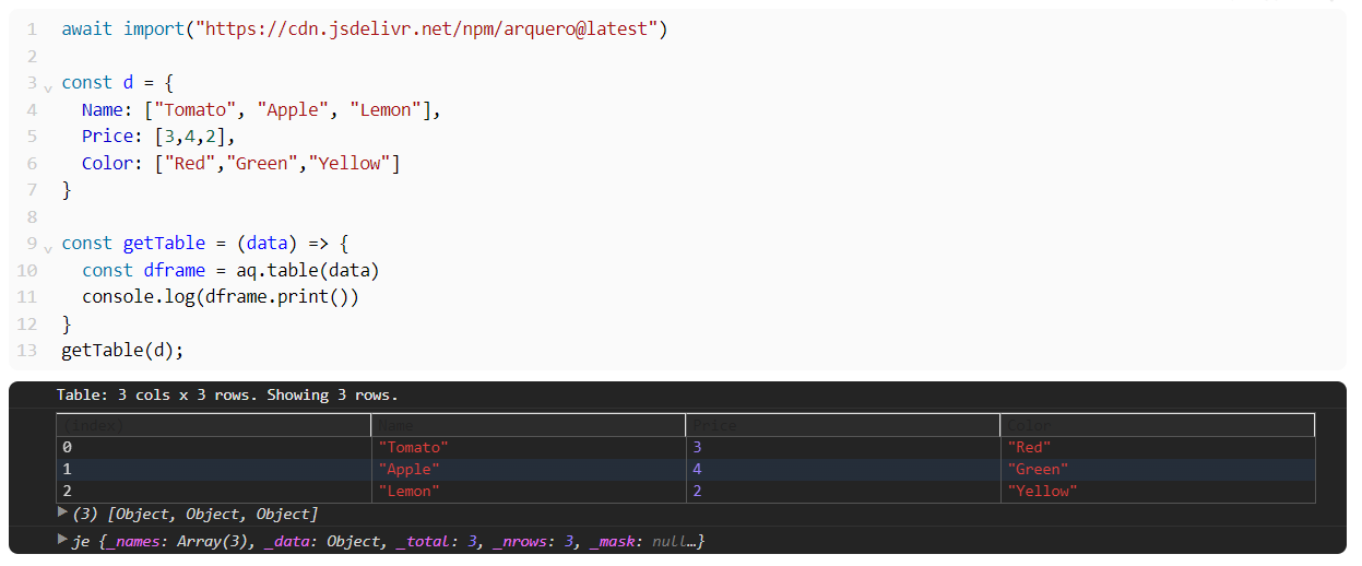
Now, that worked, but it arguably doesn’t look too great. Remember earlier when we experimented with Arquero print() and toHTML() methods? Let’s see what happens if we now create a second cell of type HTML this time, and add in a pair of <div> tags of id= value "#viz":
<div id="viz"></div>
We run this one liner, plus a new JAVASCRIPT cell:
await import("https://cdn.jsdelivr.net/npm/arquero@latest")

const d = {
  Name: ["Tomato", "Apple", "Lemon"],
  Price: [3,4,2],
  Color: ["Red","Green","Yellow"]
}

const getTable = (data) => {
  const dframe = aq.table(data)
  let v = document.getElementById("viz")
  v.innerHTML = dframe.toHTML()
}
getTable(d);
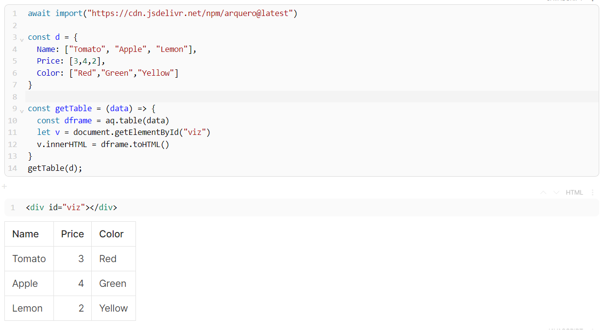
That’s much better! As you can imagine, we can do plenty of cool things this way, including outputting charts using our old friend ApexCharts!:
await import("https://cdn.jsdelivr.net/npm/arquero@latest")
await import("https://cdn.jsdelivr.net/npm/apexcharts")

const d = {
  Name: ["Tomato", "Apple", "Lemon"],
  Price: [3,4,2],
  Color: ["Red","Green","Yellow"]
}

const getTable = (data) => {
  const dframe = aq.table(data)
  return dframe;
}

const getChartData = (data) => {
  let col1 = data.array("Name");
  let col2 = data.array("Price");
  let struct = new Array();
  for (let i = 0; i < col1.length; i++) {
    struct.push( {x : col1[i],y : col2[i]} )
  }
  return struct
}

const getChart = (data) => {
  let options = {
    chart: {
      type: "bar"
    },
    plotOptions: {
      bar: {
        horizontal: true
      }
    },
    series: [{
      data: data
    }]
  }
  let chart = new ApexCharts(document.querySelector("#viz"), options);
  chart.render();
}

const df = getTable(d)
const df_plot = getChartData(df)
getChart(df_plot);
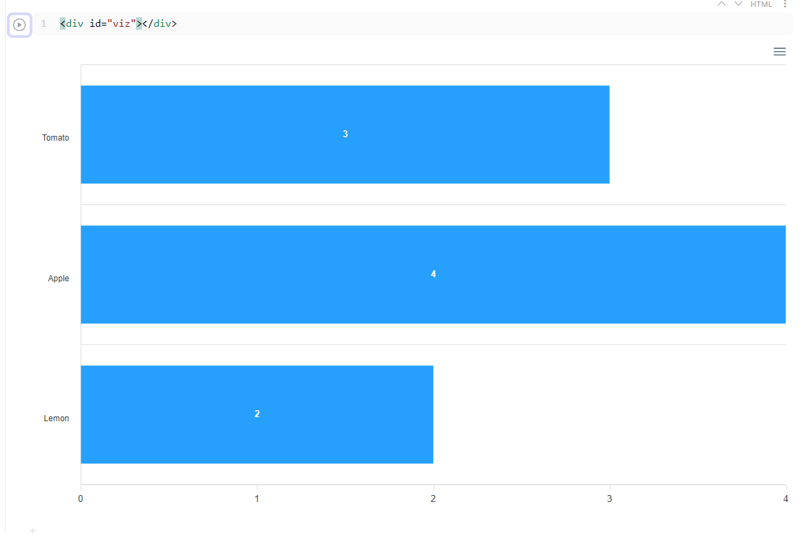
I hope you enjoyed what we just did, and please give Arquero a chance!