Exploring POS Tags Co-Occurrence With WinkNLP and Highcharts.js
An example of what we’ll be doing in this article:
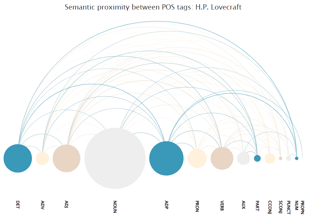
I’ve been playing around a lot with NeuralCoref lately, a pipeline extension for spaCy developed by Hugging Face. If you’re interested in coreference resolution, this article from Hugging Face’s Thomas Wolfe seems like a great place to start.
Are we going to discuss neural coreferencing today? Absolutely not.
If you head over to NeuralCoref GitHub page, your eyes will probably immediately feel drawn towards this very fancy visualisation that maps the semantic relationship between each terms within a short sentence:
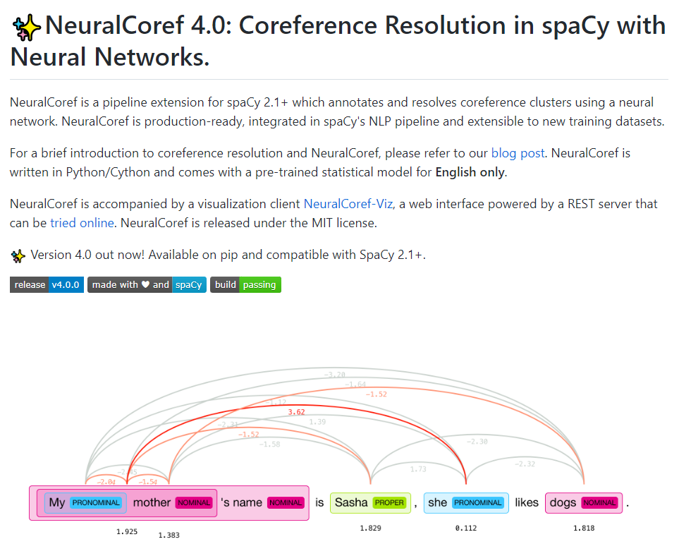
Our plan for today, is to try and see how we can create a similar-looking chart to visualise the co-occurrence of part-of-speech tags within some random corpora. In other words, a poor man’s version of the poor man’s version of a failed prototype of NeuralCoref.
Co-occurrence: terms vs POS tags
Simply put, co-occurrence is the chance of two terms appearing alongside each other in a specific order. Now, this is my over-simplified definition of an arguably much more complex concept, and there’s plenty of resources available online if you want to dig deeper into the theory.
Practically speaking, here is a very primitive way of visualising what we’re talking about:
let text = "Hi I'm Julien and I love pizzas, and I also love burgers. I'm also a lot into programming.";

const getTerms = (data) => {
  let result = new Array();
  let d = data.split(" ");
  for (let i = 0; i < d.length; i++) {
    result.push(`${d[i]} | ${d[i+1]}`);
  }
  return result;
}

const countOccurrences = (data) => {
  let result = new Object();
  for (let d of data) {
    if (result[d]) {
      result[d] += 1;
    }
    else {
      result[d] = 1;
    }
  }
  console.log(result);
}

let terms = getTerms(text)
countOccurrences(terms)
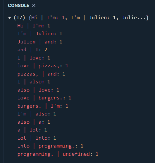
This is possibly one of the worst co-occurrence calculations that has ever been written in the whole history of natural language processing. Our tokenizer is a simple .split() by blank spaces, we didn’t remove any punctuation signs, some of our terms start with an upper case character, we should have structured our output using a matrix of nested arrays, our calcultation is a simple count of the co-occurrences, etc.. In other words, nothing to be proud of. But we can’t say we don’t have a better idea of what we’re trying to achieve today and that’s all that matters for now.
Besides, the last co-occurrence seems incomplete as its second term is showing as undefined. This makes sense as the first term for this co-occurrence happens to be the last term of our text variable. We could use the first term within our corpus, or even train a model that estimates what the next term should be (see a great example here). But Larry Wall once said that laziness was one of the three virtues of good programmers, so we’re simply going to get rid of that final co-occurrence.
Typically, co-occurrence is computed at a term level, and visualised through a correlation matrix or a heatmap. I highly recommend reading this great article from RainyNotes.net for an overview of how semantic proximity is usually approached.
But what if we wanted to, say, compare the writing style of two people? Following the term-based approach, we would tokenize an entire corpus and end up with a very large volume of term to next term occurrences. The end result would likely make identifying differences between the two writers very difficult.
One way we can solve this dimensionality issue is by using part-of-speech tags instead. If you’re not familiar with those, let’s refer ourselves to the bible of computational linguistics, Emily Bender’s “Linguistic Fundamentals for Natural Language Processing”:
“What these examples point out is the hierarchical nature of part of speech systems. Tough the most commonly used part of speech tagsets are presented as flat sets of tags, in fact categories defined by the tags can usually be grouped together into broader categories, and conversely divided more finely into more specific categories.”

winkNLP to the rescue
Alright, our new approach sounds promising, but how does that work concretely? First, let’s write a simple function that cleans a given input string and returns a “cleaned” version of it:
let text = "Hi I'm Julien and I love pizzas, and I also love burgers. I'm also a lot into programming.";

const getCleanedTerms = (data) => {
  let punctuation = '!"#$%&\()*+,./:;<=>?@[\\]^_`{|}~';
  let regex = new RegExp("[" + punctuation + "]", "g");
  let result = data
    .split(" ")
    .map(
      d => d
      .replace(regex, "")
      .toLowerCase()
     );
  return result.join(" ");
}

let cleaned = cleanTerms(text);
console.log(`Original sentence:\n\t${text}\n\nCleaned sentence:\n\t${cleaned}`)

I recently wrote an article showing how to use winkNLP, a developer-friendly natural language processing package for the JavaScript ecosystem. It offers a ton of really useful features, including a fast and powerful BM25 vectorizer that you should definitely switch over to if you’re looking for something statistically more accurate that its TF-IDF cousin.
Simply npm install winkNLP and paste the following lines into your .js file:
const winkNLP = require("wink-nlp");
const model = require("wink-eng-lite-web-model");
const nlp = winkNLP(model);
const its = nlp.its;
const as = nlp.as;
If you’re familiar with spaCy, how we’re going to infer our part-of-speech tags from the cleaned string that we created earlier should look somewhat familiar:
const getTags = (data) => {
  const doc = nlp.readDoc(data);
  const result = doc.tokens().out(its.pos);
  return result;
}

let cleaned = cleanTerms(text);
let tags = getTags(cleaned);
console.log(tags)
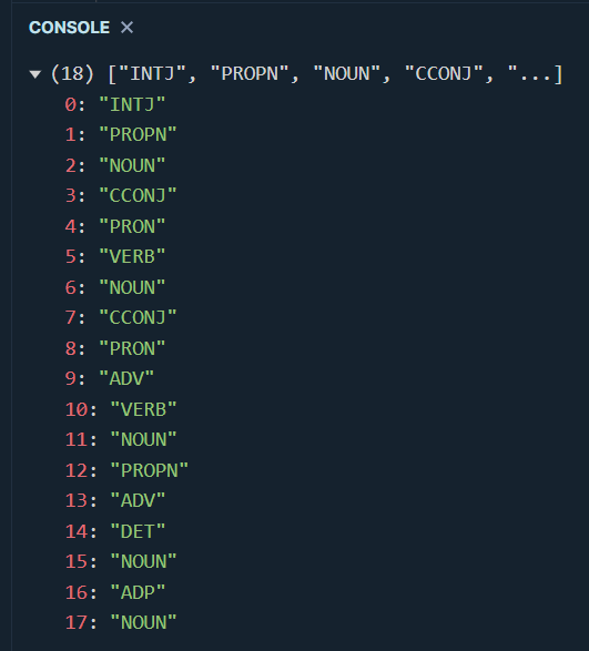
Finally, let’s run these newly created tags through our getTerms() and countOccurrences() functions:
let cleaned = cleanTerms(text);
let tags = getTags(cleaned);
let occurrences = getTerms(tags.join(" "));
let c = countOccurrences(occurrences)
console.log(c)
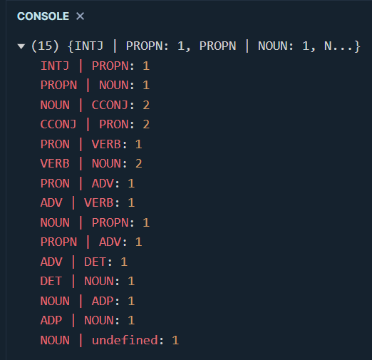
A not so common type of chart
If you dont mind, let’s go back to NeuralCoref for a second. Though the purpose of this article clearly isn’t to even dream of replicating its annotation algorithm for coreference clustering, we still want to be able to map the far less complex relationship between our POS tags.
If you’ve been wondering since the begining of this article why we chose JavaScript over Python, here’s your answer: nothing beats the JavaScript ecosystem when it comes to visualisation libraries. Highcharts.js is one of these super powerful packages that offers more chart types and personalisation options than anything Python can ever wish it could offer. It features a lot of exotic and niche visualisations, like this familiar-looking thing called an “arc diagram”. Here’s what the documentation page says:
“The arc-diagram chart visualizes relations and their strength between nodes of a data set.”
In other words, we’re talking about some sort of network graph, but flatter (I hope you love my over-simplifying everything). Just below the above description comes a sample code snippet and instructions as to what our data structure should look like:
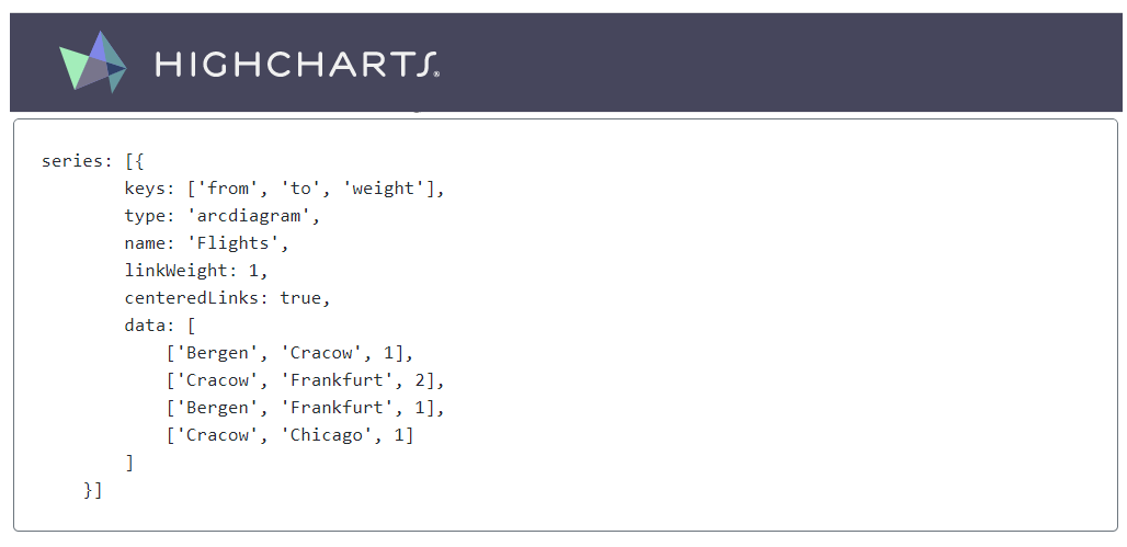
Right, we need to sligtly modify our countOccurrences() function:
const countOccurrences = (data) => {
    let temp = new Object();
    let result = new Array();
    for (let d of data) {
        if (temp[d]) {
            temp[d] += 1;
        }
        else {
            temp[d] = 1;
        }
    }
    for (let t in temp) {
        result.push( [t.split(" ")[0], t.split(" ")[1],temp[t]] );
    }
    return result;
}
We also need a super simple html page with a simple pair of <div> tags. Though we probably shouldn’t, we’ll be loading our winkNLP and Highcharts packages directly through a content delivery network. Make sure that your html file contains the following lines of code:
<head>

    <script src="https://code.highcharts.com/highcharts.js"></script>
    <script src="https://code.highcharts.com/modules/sankey.js"></script>
    <script src="https://code.highcharts.com/modules/arc-diagram.js"></script>
    <script src="https://code.highcharts.com/modules/accessibility.js"></script>

</head>
<body>

    <div id="viz" style="height: 400px; max-width: 800px; margin: 0 auto;"></div>

    <script type="module">

        import winkNlp from "https://cdn.skypack.dev/wink-nlp";
        import winkEngLiteWebModel from "https://cdn.skypack.dev/wink-eng-lite-web-model";

    </script>

</body>
Still within our <script> tags, after our
const getChart = (data,chart_title) => {
    Highcharts.chart(
        "viz",
        {
            colors: ["#003f5c","#58508d","#58508d","#ff6361","#ffa600"],
            title: {
                text: chart_title
             },
             series: [{
                 keys: ["from", "to", "weight"],
                 type: "arcdiagram",
                 name: "Ngrams",
                 linkWeight: 1,
                 centeredLinks: true,
                 dataLabels: {
                     rotation: 90,
                     y: 80,
                     align: "left",
                     color: "black"
                 },
                 offset: "65%",
                 data: data
             }]
         }
     )
}

let sentence = "Hi I'm Julien and I love pizzas, and I also love burgers. I'm also a lot into programming.";
let cleaned = getCleanedTerms(sentence);
let tokens = getTags(cleaned);
let occurrence = getCoOccurrence(tokens,1);
let c = getCount(occurrence);
getChart(c,"Semantic proximity between terms");
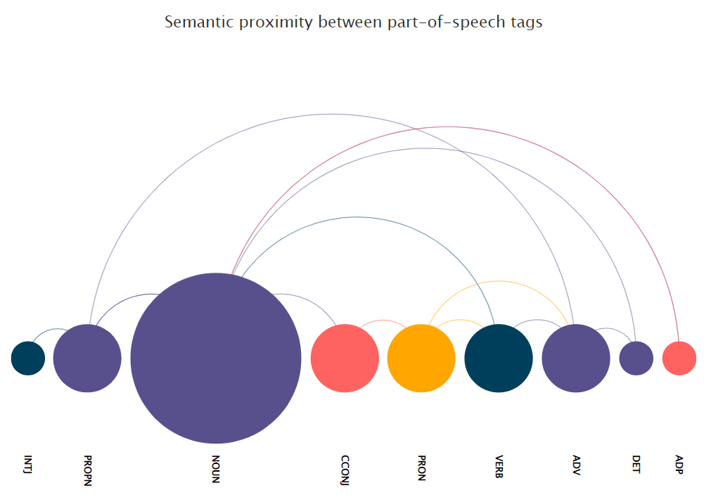
Now dear reader, how cool is this? We can very clearly see the various relationships between our part-of-speech tags, and as the arc diagram chart is fully interactive we can get some information around the co-occurrence frequency of our tags by simply positioning our mouse cursor over any of the nodes.
Please note that we can use terms instead of part-of-speech tags if we want to (I’m also changing the values for the global color scheme):
let cleaned = getCleanedTerms(sentence); let occurrence = getCoOccurrence(cleaned.split(" "),1);
let c = getCount(occurrence);
getChart(c,"Semantic proximity between terms");
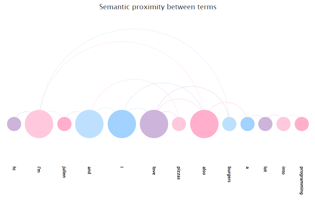
Though as discussed earlier, the more terms we have, the less readable our arc diagram is going to be. And that’s why we want to stick to POS tags instead.
But wait a second. Didn’t we just write that arc diagrams worked a bit like network graphs? Seems to me like a good opportunity to also see what how these two visualization types differ. Let’s create a second html page, and this paste in the following lines:
<head>
    <script src="https://code.highcharts.com/highcharts.js"></script>
    <script src="https://code.highcharts.com/modules/networkgraph.js"></script>
    <script src="https://code.highcharts.com/modules/accessibility.js"></script>
</head>
This is our lucky day: we won’t have look very far as HighCharts also features some very neat-looking network graphs! We’re going to slightly longer text, using the first chapter for The Call of Cthulhu by H.P. Lovecraft (source). We’ll see in a just about a minute why we’ve decided to tokenize this particular novel excerpt. For now, let’s slightly modify our getTags() function so that is returns for the original term and its corresponding POS tag:
let text = "Hi I'm Julien and I love pizzas, and I also love burgers. I'm also a lot into programming.";

const getTags = (data) => {
  let result = new Array();
  const doc = nlp.readDoc(data);
  const tokens = doc.tokens().out()
  const tags = doc.tokens().out(its.pos);
  if (tokens.length === tags.length) {
    for (let i = 0; i < tokens.length; i++) {
      result.push([tokens[i],tags[i]]);
    }
  }
  else {
    return "Mismatched length"
  }
  return result;
}

const terms = cleanTerms(text);
console.log(getTags(terms))
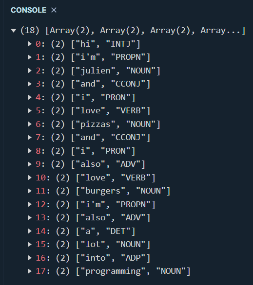
As the purpose of this article isn’t to visualise semantic proximity using a network graph, we won’t be spending too much time personalising the look and feel of our chart. HighCharts provides a useful CodePen playground for each of its examples, and the code below is literally nothing more than a slightly amended copy and paste version of their sample force-directed network graph:
const getPlot = (data, chart_title) => {
  Highcharts.chart("viz", {
    chart: {
      type: "networkgraph",
      height: "100%",
    },
    title: {
      text: chart_title,
      align: "left",
    },
    plotOptions: {
      networkgraph: {
        keys: ["from", "to"],
        layoutAlgorithm: {
          enableSimulation: false,
        },
      },
    },
    series: [
      {
        accessibility: {
          enabled: false,
        },
        dataLabels: {
          enabled: true,
          linkFormat: "",
        },
        id: "lang-tree",
        data: data,
      },
    ],
  });
};


getPlot(network,"Network graph for H.P. Lovecraft");
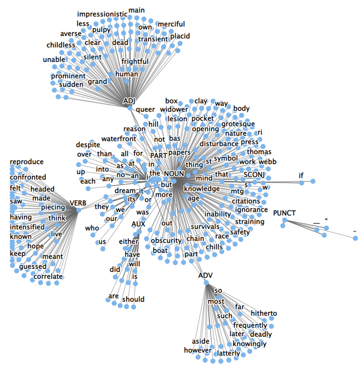
Arguably, network graphs do a fantastic job at identifying clusters and outliers. But the relationship between our terms and POS tags is lost.
Battle of the writers
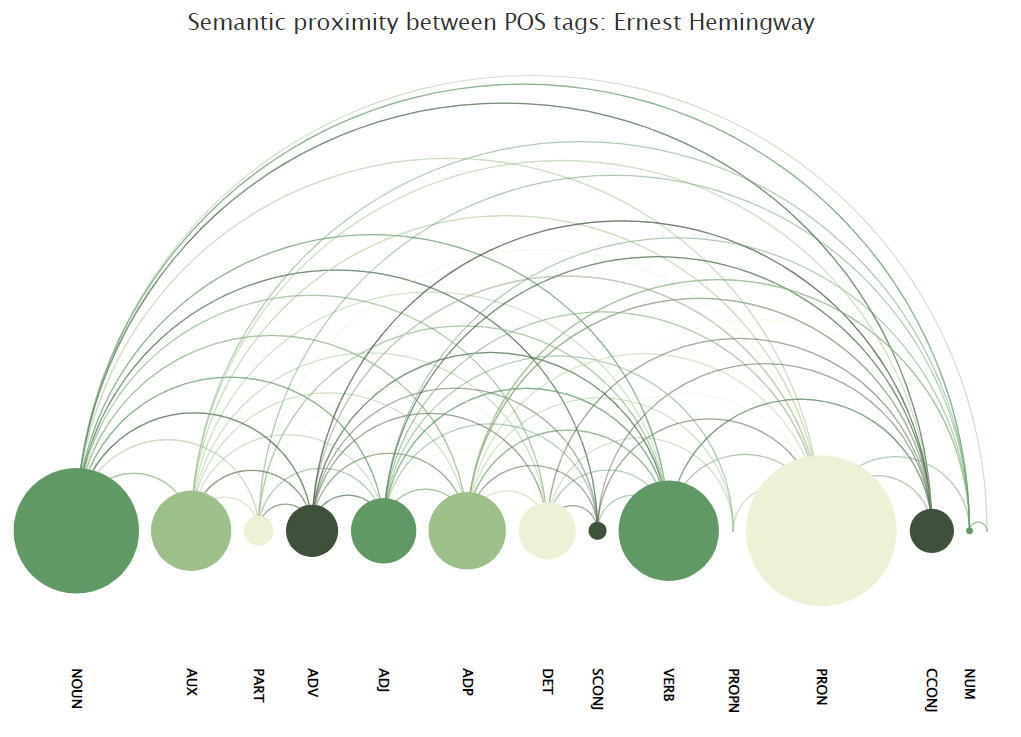
Though our arc diagram chart is fairly simplistic, we can still use it to compare the writing style of two legendary American writers that I believe don’t have much in common, Ernest Hemingway and H.P. Lovecraft.
For this arguably stupid but fun exercise, we’re going to pass the first chapter of the following two novels through our previously created functions:
- True at First Light by Ernest Hemingway (source)
- The Call of Cthulhu by H.P. Lovecraft (source)

How interesting is this! Lovecraft seems to be using a wider range of part-of-speech tags, while good old Ernest loves nouns and pronouns mainly. Now of course, there is nothing statistical in any of those two charts, but I think that we can see some potential use cases for our little POS tags diagram: spam detection, authorship and licensing, etc..
Feel free to reach out to me if you see how we could further improve our code, which you can find here:
<!DOCTYPE html>
<html lang="en">
<head>
    <meta charset="UTF-8">
    <meta http-equiv="X-UA-Compatible" content="IE=edge">
    <script src="https://code.highcharts.com/highcharts.js"></script>
    <script src="https://code.highcharts.com/modules/sankey.js"></script>
    <script src="https://code.highcharts.com/modules/arc-diagram.js"></script>
    <script src="https://code.highcharts.com/modules/accessibility.js"></script>
    <meta name="viewport" content="width=device-width, initial-scale=1.0">
    <title>Document</title>
</head>
<body>

    <div id="viz" style="height: 700px; max-width: 800px; margin: 0 auto;"></div>

    <script type="module">

        import winkNlp from 'https://cdn.skypack.dev/wink-nlp';
        import winkEngLiteWebModel from 'https://cdn.skypack.dev/wink-eng-lite-web-model';

        const getTags = (data) => {
            const nlp = winkNlp(winkEngLiteWebModel);
            let its = nlp.its;
            let as = nlp.as;
            const doc = nlp.readDoc(data);
            const result = doc.tokens().out(its.pos);
            return result;
        }

        const getCleanedTerms = (data) => {
            let punctuation = '!"#$%&\()*+,./:;<=>?@[\\]^_`{|}~';
            let regex = new RegExp("[" + punctuation + "]", "g");
            let result = data.split(" ").map(
                d => d
                .replace(regex, "")
                .toLowerCase()
                    );
            return result.join(" ");
        }

        const getCoOccurrence = (data,howmany) => {
            let result = new Array();
            for (let i = 0; i < data.length; i++) {
                if (typeof data[i + howmany] === "string") {
                result.push(`${data[i]} ${data[i+howmany]}`);
                }
            }
            return result;
        }

        const getCount = (data) => {
            let temp = new Object();
            let result = new Array();
            for (let d of data) {
                if (temp[d]) {
                temp[d] += 1;
                }
                else {
                temp[d] = 1;
                }
            }
            for (let t in temp) {
                result.push( [t.split(" ")[0], t.split(" ")[1],temp[t]] );
            }
            return result;
        }

        const getChart = (data,chart_title) => {
            Highcharts.chart(
                "viz",
                {
                    //colors: ["#003f5c","#58508d","#58508d","#ff6361","#ffa600"],
                    //colors: ["#cdb4db","#ffc8dd","#ffafcc","#bde0fe","#a2d2ff"],
                    colors: ["#3A98B9","#FFF1DC","#E8D5C4","#EEEEEE"],
                    title: {
                        text: chart_title
                    },
                    series: [{
                    keys: ["from", "to", "weight"],
                    type: "arcdiagram",
                    name: "Ngrams",
                    linkWeight: 1,
                    centeredLinks: true,
                    dataLabels: {
                        rotation: 90,
                        y: 110,
                        align: 'left',
                        color: 'black'
                        },
                    offset: '65%',
                    data: data
                }]
                }
            )
        }

        let sentence = "Hi I'm Julien and I love pizzas, and I also love burgers. I'm also a lot into programming.";
        let cleaned = getCleanedTerms(text);
        let tokens = getTags(cleaned);
        let occurrence = getCoOccurrence(tokens,1);
        let c = getCount(occurrence);
        getChart(c,"Semantic proximity between POS tags");
    </script>
</body>
</html>